So, who dies in Avengers Doomsday? Every week there’s a new leak, and every leak says something different.
Don’t worry, I’ll make this simple. Below is who dies in Avengers Doomsday, according to the leaks, ranked by how believable each death is.
Important: Everything in this post is based on rumors and leaks. Marvel Studios has not confirmed any of it. Treat this as “what insiders are saying”, not “what will happen”. Spoilers ahead.
If you don’t want to read everything, here’s who dies in Avengers Doomsday, according to the rumors:
#
Character
Rumored death
Believability
1
Tobey’s Spider-Man and Wolverine
Right at the start
High
2
Loki
Killed by Doctor Doom
High (how is unclear)
3
Peggy Carter and Steve’s son
The darkest part
Medium
4
Mystique and Nightcrawler
The X-Men side
High
5
Professor X
Killed by a witch
Medium
6
Bucky
A sacrifice for Steve
High
7
Sentry
A hero’s sacrifice
Low to medium
8
Shuri
The shakiest rumor
Low to medium
9
Thor
The brutal finish
Medium
Now let’s break each one down.
How Reliable Are These Avengers Doomsday Leaks?
Here’s the truth: nobody outside Marvel has seen the final cut. So anyone telling you for sure who dies in Avengers Doomsday is guessing. These leaks come from scoopers on X and fan roundups, and they don’t always agree.
One detailed breakdown that insiders called largely accurate lists Nightcrawler, Mystique, Loki, Bucky and Steve’s son James among the major deaths.
1. Tobey’s Spider-Man and Wolverine Die Early
Here’s the truth: the movie reportedly doesn’t ease you in.
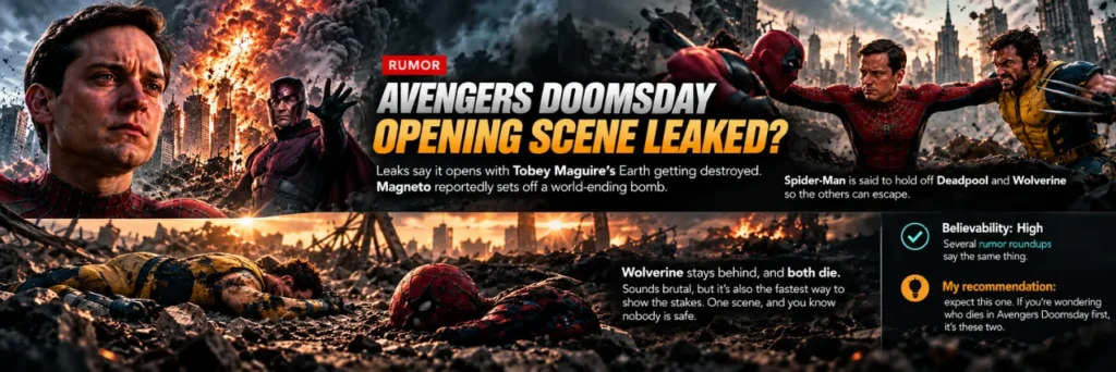
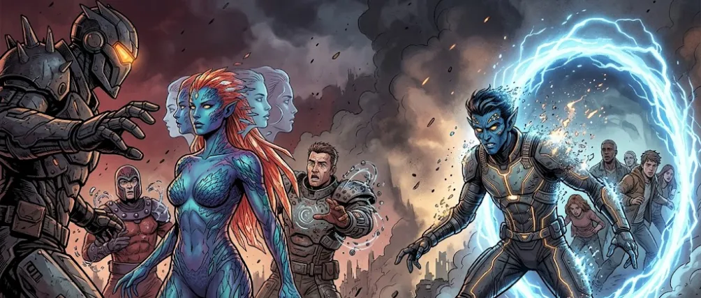
Leaks say it opens with Tobey Maguire’s Earth getting destroyed. Magneto reportedly sets off a world-ending bomb.
Spider-Man is said to hold off Deadpool and Wolverine so the others can escape. Wolverine stays behind, and both die.
Sounds brutal, but it’s also the fastest way to show the stakes. One scene, and you know nobody is safe.
Believability: High. Several rumor roundups say the same thing.
My recommendation: expect this one. If you’re wondering who dies in Avengers Doomsday first, it’s these two.
2. Loki Dies at Doctor Doom’s Hands
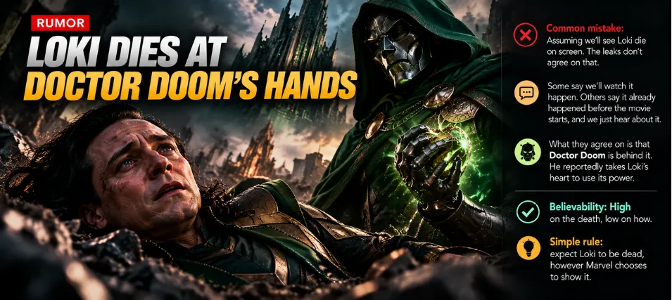
Common mistake: assuming we’ll see Loki die on screen. The leaks don’t agree on that.
Some say we’ll watch it happen. Others say it already happened before the movie starts, and we just hear about it.
What they agree on is that Doctor Doom is behind it. He reportedly takes Loki’s heart to use its power.
Believability: High on the death, low on how.
Simple rule: expect Loki to be dead, however Marvel chooses to show it.
3. Peggy Carter and Steve’s Son
Here’s where it gets dark.
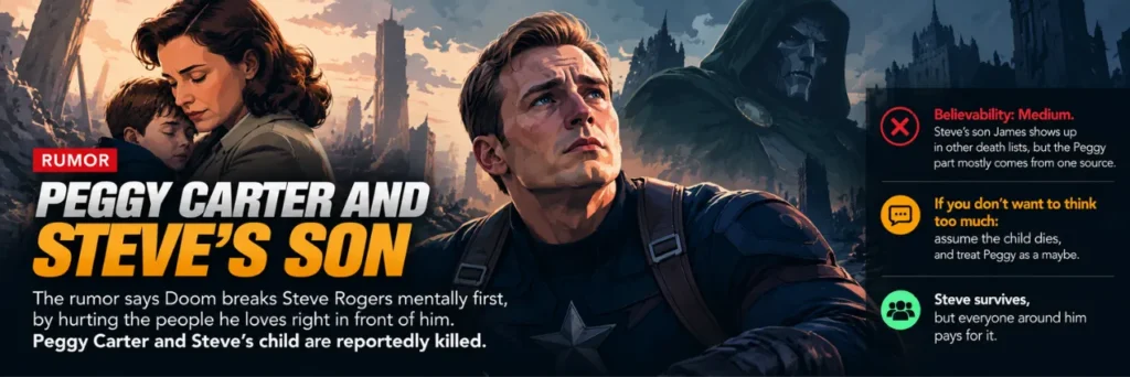
The rumor says Doom breaks Steve Rogers mentally first, by hurting the people he loves right in front of him.
Peggy Carter and Steve’s child are reportedly killed. Steve survives, but everyone around him pays for it.
Believability: Medium. Steve’s son James shows up in other death lists, but the Peggy part mostly comes from one source.
If you don’t want to think too much: assume the child dies, and treat Peggy as a maybe.
4. Mystique and Nightcrawler
Here’s where the X-Men side pays the price.
Mystique is rumored to die while trying to save Magneto’s life. Doom reportedly catches her in the middle of a shapeshift.
Nightcrawler’s death is the clever one. He teleports people to safety, so removing him means the Avengers have no easy escape.
Believability: High. Both names appear in more than one leak.
My recommendation: lock these two in.
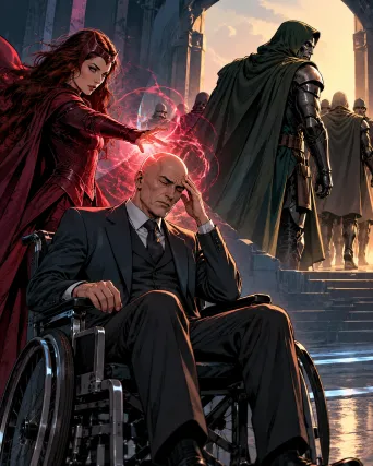
5. Professor X Dies (Again)
Simple rule: if Charles Xavier shows up in live action, don’t get attached.
The rumor says Doom doesn’t kill him directly. A witch from Doom’s side does, and then leaves with his group.
Shocking? Sure. Surprising? Honestly, no. His live-action track record isn’t great.
Believability: Medium. Only one source on this one.
6. Does Bucky Die in Avengers Doomsday?
Here’s where it gets interesting. This is the emotional one.
By this point, Steve has reportedly lost his family and almost everyone he trusts. When Doom comes for him, Bucky sacrifices himself to save him.
That loss is said to be what pushes Steve to go after Doom in future stories.
Believability: High. Bucky appears in multiple death lists, so per the leaks, the answer is yes.
Common mistake: thinking it’s permanent. More on that below.
7. Sentry’s Hero Sacrifice
Sentry reportedly has very little screen time. But what he does get is said to be impactful.
Two rumors are floating around. One has him fighting Doom directly. The other has him dying as a hero, trying to slow down another planet crashing into Earth.
It’s a movie, not a comic book, so he can’t win that one. He reportedly dies between two colliding worlds.
Believability: Low to medium. The two versions conflict.
My recommendation: expect the hero-sacrifice version. It’s the more cinematic one.
8. Shuri (The Shakiest Rumor)
Here’s the truth: this is the weakest rumor on the list.
The claim is that Shuri defeats one of Doom’s followers, then dies from her injuries after the fight. Doom doesn’t kill her directly.
Some fans tie this to Black Panther’s future and who takes the mantle next. That part is pure speculation, so I’d skip it for now.
Believability: Low to medium. Thin sourcing.
If you don’t want to think too much: file this under “maybe”.
9. Thor’s Brutal Finish
Last, but not least, Thor. And this might be the most brutal one.
He’s rumored to be the last major hero standing against Doom. Doom reportedly drains his Odin Force, cuts off a hand and leaves him among exploding planets.
Thor reportedly has the most raw power in the MCU right now. That’s exactly why Doom has to take him down.
Believability: Medium. It fits other Thor rumors, but the details are all unconfirmed.
My Take: Who Dies in Avengers Doomsday?
So, who dies in Avengers Doomsday? If I had to bet, I’d put my money on Loki, Nightcrawler, Mystique, Bucky and Tobey’s Spider-Man.
Doomsday hits US theaters on December 18, 2026, so we won’t have to wait long. If you want to avoid spoilers, close this tab and see it fresh.
Which death are you most excited for? Tell me in the comments.
Avengers Doomsday Deaths: FAQs
Who dies in Avengers Doomsday according to leaks?
According to leaks, the list of who dies in Avengers Doomsday includes Tobey’s Spider-Man, Wolverine, Loki, Mystique, Nightcrawler, Professor X, Bucky, Sentry, Shuri, Peggy Carter and Steve’s son. Marvel has not confirmed any of them.
Does Bucky die in Avengers Doomsday?
Leaks say Bucky sacrifices himself to save Steve Rogers. It’s a rumor, not a confirmed plot point.
Does Loki die in Avengers Doomsday?
Most leaks say yes, killed by Doctor Doom. They disagree on whether we see it on screen.
Are the Avengers Doomsday leaks confirmed?
No. Marvel Studios has not confirmed any leaked death or plot detail, so treat everything as unverified.
When is Avengers Doomsday releasing?
Avengers Doomsday is set for December 18, 2026 in the US.
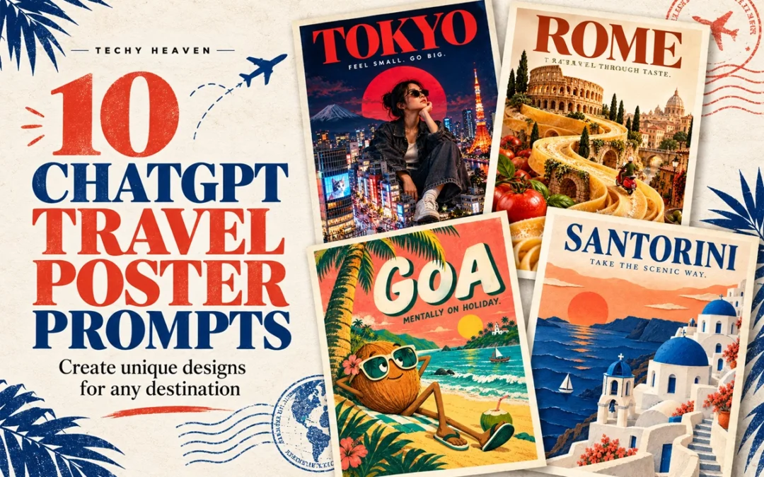
Travel posters do not have to follow the same predictable layout. With the right ChatGPT travel poster prompts, one destination can be transformed into a surreal miniature city, a brutalist collage, a cinematic night scene or even a handcrafted paper world.
Below are ten creative poster directions you can customise for any city, country or landmark.
In This Post
How to Use These Travel Poster Prompts
Replace [PLACE NAME] with your chosen destination and paste the prompt into ChatGPT.
For Instagram posts and digital posters, ask for a vertical 4:5 composition. You can also change the tagline, colours, typography and landmarks.
1. Giant Tourist, Tiny City
LOCATION: [PLACE NAME]
Create a surreal travel poster featuring a giant stylish traveller sitting among this destination’s miniature landmarks and streets. Use realistic photographic collage, playful scale, bold editorial typography, and colours inspired by the place. Add the location name and “FEEL SMALL. GO BIG.” Vertical composition, premium finish, no extra text or mockup.
2. Destination Inside Typography
LOCATION: [PLACE NAME]
Create a typography-led travel poster with the location name in massive lettering. Integrate recognisable local landscapes inside the letters, with a few elements breaking beyond their edges. Use a clean background, a refined colour palette, and generous negative space. Make the word clearly readable. Vertical composition, no extra text or mockup.
3. Boarding Pass Poster
LOCATION: [PLACE NAME]
Design a travel poster as an oversized boarding pass with the location name as the main destination. Include subtle perforations, travel stamps, route graphics, and one striking photograph of a local landmark. Use precise ticket-style typography, warm paper texture, and one bold accent colour. Add “DESTINATION: SOMEWHERE NEW.” Vertical layout, minimal supporting details, no mockup.
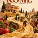
4. Travel Through Taste
LOCATION: [PLACE NAME]
Create a surreal travel poster where a signature local dish transforms into the destination’s landscape, with miniature landmarks integrated into the food. Use appetising realistic textures, an unexpected composition, and a clean studio background. Add elegant bold typography with the location name and “TRAVEL THROUGH TASTE.” Vertical layout, no extra text or mockup.
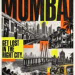
5. Loud City, Loud Poster
LOCATION: [PLACE NAME]
Create a bold brutalist travel poster using authentic local street photography, oversized stretched typography, gritty textures, and sharp overlapping colour blocks. Combine monochrome imagery with one fluorescent accent. Make the location name dominant and add “GET LOST IN THE RIGHT CITY.” Controlled visual chaos, strong readability, vertical layout, no mockup.
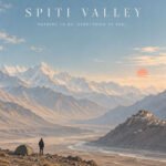
6. The Quietest View
LOCATION: [PLACE NAME]
Create a minimalist travel poster showing one tiny traveller within an expansive, recognisable landscape of this destination. Use soft pastel colours, atmospheric light, subtle grain, and generous negative space. Pair the location name with small elegant typography reading “NOTHING TO DO. EVERYTHING TO FEEL.” Calm, premium vertical composition, no extra elements or mockup.
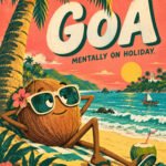
7. Odd Travel Character
LOCATION: [PLACE NAME]
Create a quirky illustrated travel poster starring an eccentric character inspired by this destination’s landscape, food, or landmark. Give it exaggerated proportions, expressive eyes, and unexpected travel accessories. Use playful typography, bold flat colours, and subtle print texture. Include the location name and “MENTALLY ON HOLIDAY.” Vertical layout, distinctive character design, no mockup.
8. Destination in a Glass Box
LOCATION: [PLACE NAME]
Create a travel poster featuring an intricate miniature version of this destination inside a transparent glass cube. Include recognisable landmarks, local terrain, tiny streets, and atmospheric details. Use realistic materials, soft studio lighting, and a clean background. Add the location name with refined museum-label typography and “A WHOLE WORLD WITHIN.” Vertical layout, no mockup.
9. After Dark
LOCATION: [PLACE NAME]
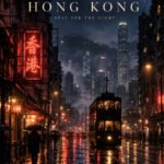
Create a cinematic travel poster showing this destination after dark, with authentic local architecture, atmospheric shadows, and luminous reflections. Use deep indigo tones with restrained warm or neon accents. Compose it like an independent film poster, with elegant typography displaying the location name and “STAY FOR THE NIGHT.” Vertical layout, no extra text or mockup.
10. Paper World
LOCATION: [PLACE NAME]
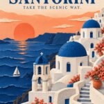
Create a handcrafted paper-cut travel poster depicting this destination’s iconic landmarks and landscape through layered coloured paper. Use tactile edges, subtle paper grain, realistic soft shadows, and a limited palette of three complementary colours. Integrate the location name into the composition and add “TAKE THE SCENIC WAY.” Premium vertical layout, no extra text or mockup.
The Six-Part Prompt Formula
When creating your own ChatGPT image prompt, remember this structure:
Mention specific landmarks instead of requesting an entire city.
Limit the design to two or three main colours.
Keep poster text short and clearly specify the exact wording.
Ask for clean margins and a strong typography hierarchy.
Generate a few versions before selecting the final composition.
If the text is incorrect, request a targeted typography correction.
Frequently Asked Questions
Can I use these prompts for any destination?
Yes. Replace the location placeholder and add details associated with your chosen city, country, island or landmark.
What image size should I use?
A vertical 4:5 format works well for Instagram carousel posts. For printing, generate the artwork at the highest available resolution.
Can ChatGPT add text to travel posters?
Yes, but you should provide the exact text inside quotation marks. Always check the final spelling before publishing or printing.
Which travel poster style should I try first?
Start with the destination-inside-typography or minimalist landscape concept. Both work with a wide range of locations and are easy to customise.
These ten ChatGPT travel poster prompts are starting points. Change the destination, visual metaphor, colours and art direction to create a travel-poster collection that feels completely your own.
And you’ve probably heard the word “n8n” thrown around.
Here’s the truth: n8n sounds technical, but it’s not. Let’s make this simple.
In This Post
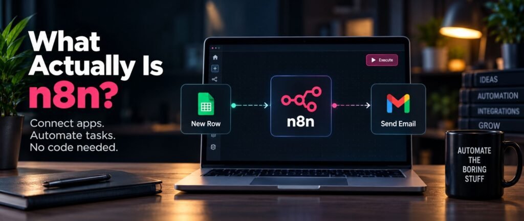
What Actually Is n8n?
Most people hear “automation tool” and picture code, APIs, developer stuff.
n8n isn’t that. It’s a low-code platform that lets you connect apps and automate tasks without writing a single line of code.
Think of it like this: you tell it If “X” happens, do “Y” and it just runs in the background. No coding degree required.
My recommendation: if the word “workflow” scares you, forget it for now. Just think of n8n as your Personal Agent that never sleeps.
Who Is n8n Actually For?
people assume automation tools are only for developers or tech teams.
Not true. n8n is genuinely built for marketers, founders, small business owners, and anyone tired of doing the same repetitive task by hand. If you’ve ever copy-pasted data between two tools, or manually sent the same follow-up message fifty times that’s exactly the pain n8n kills.
Simple rule: if a task is repetitive and rule-based, n8n can probably automate it.
Do You Need to Know How to Code?
Short answer – no.
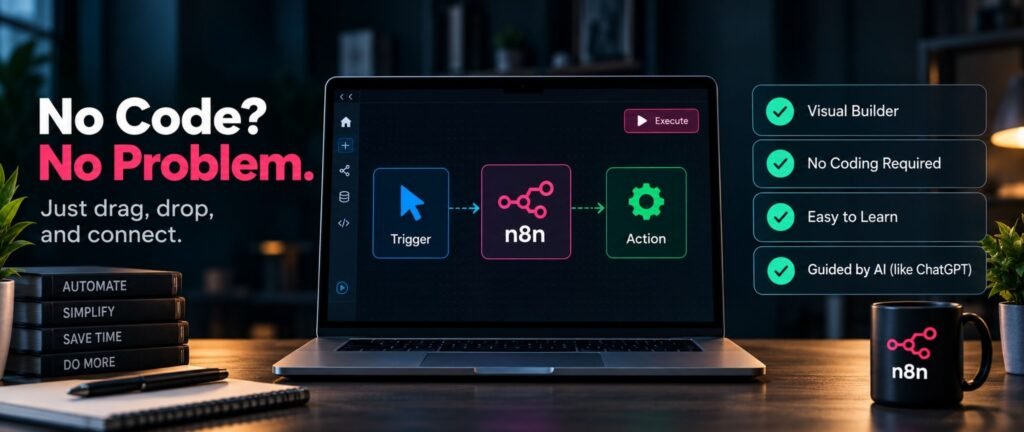
n8n is designed as a visual, drag-and-drop tool. You’re connecting blocks, not writing scripts.
Even people with zero coding background pick this up fast, because the moment you get stuck, tools like ChatGPT can walk you through the exact fix.
If you don’t want to think too much: just start with one small automation. Don’t try to learn “everything” before touching the tool.
What Will You Actually Learn as a Beginner?
Still confused about where to start? Here’s the roadmap that actually matters:
How a workflow is structured
Core concepts like triggers, nodes, and data flow
A few essential nodes you’ll use constantly
Building your first real, working automation
That last point is the one that matters most. Not theory, an actual automation you can use.
My recommendation: don’t binge every concept first. Build something small on day one. Confidence comes from doing, not watching.
How Should You Actually Learn n8n?
Here’s where it gets interesting, the best way to learn n8n isn’t reading docs cover to cover.
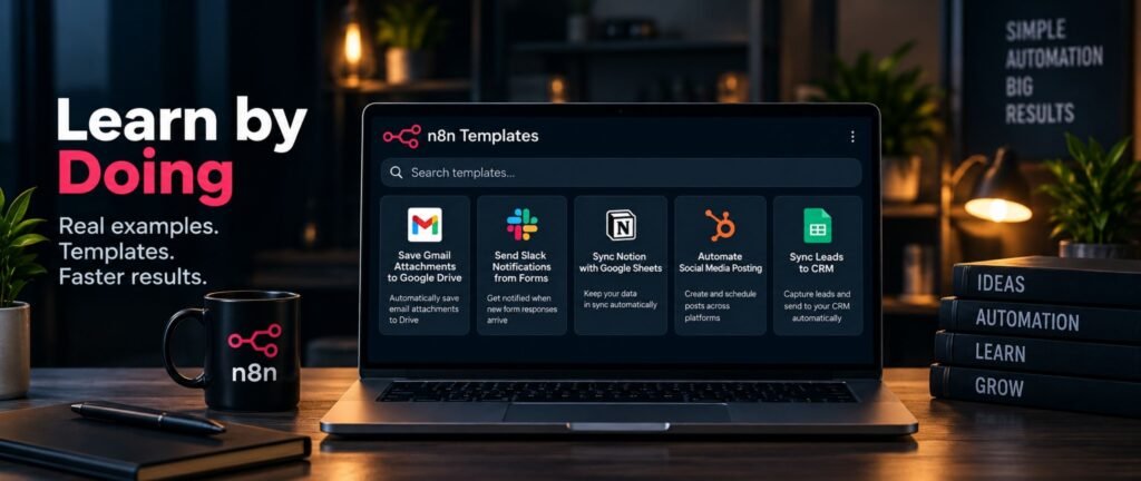
It’s short, focused lessons + real examples + templates you can copy and tweak for your own use case.
Downloadable workflow templates especially save you hours, because you’re editing something that already works instead of starting from a blank canvas.
Simple rule: learn by doing, not by watching theory videos on loop.
This Is Part 1 of a Bigger n8n Series
Still confused? Don’t worry — this is just the starting point.
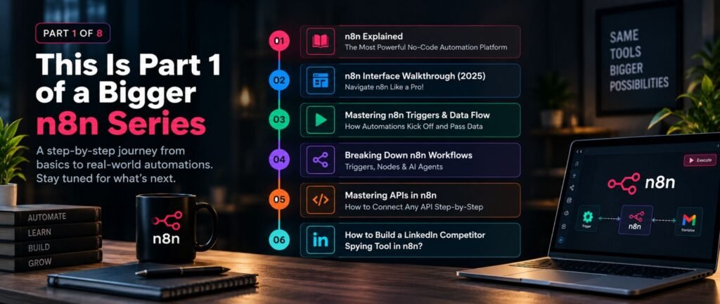
This is post 1 of an 8-part n8n series. Each one builds on the last, so you’re not stuck relearning basics every time.
Here’s what’s coming next:
n8n Explained: The Most Powerful No-Code Automation Platform
Deep Dive: n8n Interface Walkthrough (2025) — Navigate n8n Like a Pro!
Mastering n8n Triggers & Data Flow: How Automations Kick Off and Pass Data
Breaking Down n8n Workflows: Triggers, Nodes & AI Agents
Mastering APIs in n8n: How to Connect Any API Step-by-Step
How to Build a LinkedIn Competitor Spying Tool in n8n?
My recommendation: bookmark this page. As each post goes live, I’ll link it here — so this becomes your one-stop n8n roadmap.
Should You Bother Learning n8n in 2026?
Here’s the truth: automation isn’t a “nice to have” skill anymore, it’s quietly becoming a baseline expectation.
Businesses want fewer manual tasks. Creators want more time. n8n sits right in the middle of that shift.
If I had to recommend one thing – don’t wait until you “have time” to learn this. Start with one workflow. The time-saving snowballs from there.
FAQs
Is n8n free to use?
n8n offers a free tier that’s more than enough for beginners to start automating without spending anything upfront.
Do I need coding knowledge to use n8n?
No. n8n is a no-code/low-code tool built around visual workflows, not scripting.
What can I automate with n8n as a beginner?
Simple repetitive tasks like moving data between apps, auto-sending messages, or triggering actions based on events are the easiest starting point.
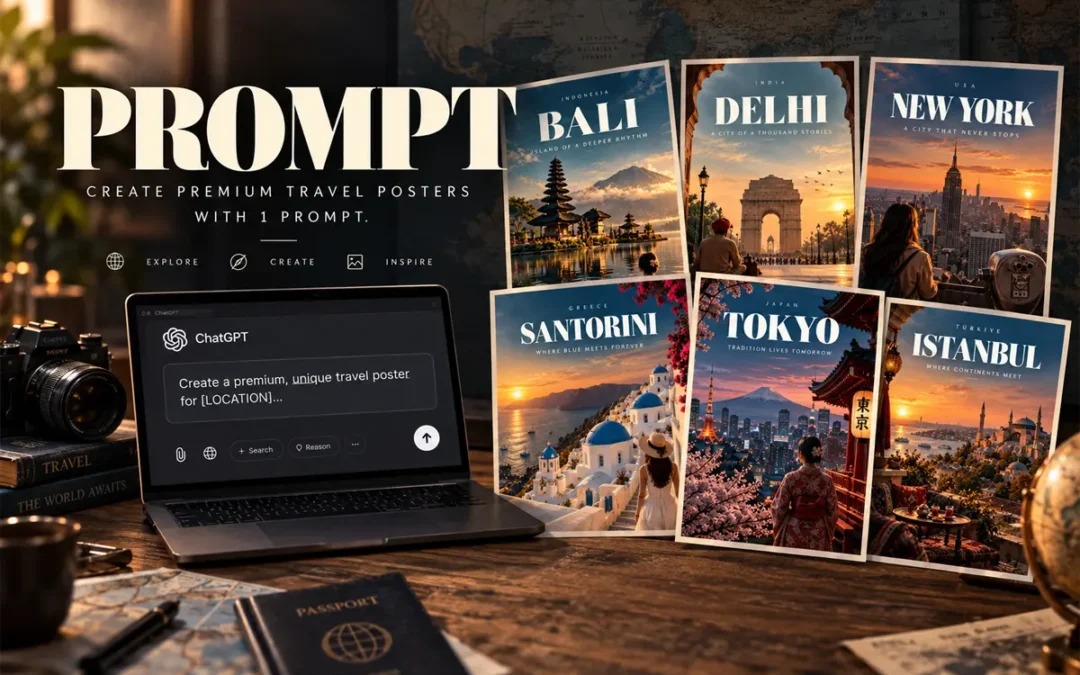
Start by replacing the location with the destination you want to showcase.
For example:
Bali
Tokyo
Delhi
New York
Santorini
Istanbul
Paris
Dubai
London
Singapore
The Complete AI Travel Poster Prompt
Prompt Card
01
AI Image Prompt
Premium Travel Poster
Create image of a premium, unique travel poster for [LOCATION]. Capture its most iconic landscape, architecture, culture, or atmosphere in a cinematic, editorial style. Use bold, sophisticated typography with [LOCATION] as the main title, supported by a short destination-specific tagline. Strong composition, dramatic perspective, refined color palette, realistic details, subtle film grain, luxury travel-magazine aesthetic, print-ready, visually striking, minimal clutter, professional art direction. Avoid generic stock-photo styling and excessive text. –ar 4:5
You can now combine everything into one reusable template:
Create image of a premium, unique travel poster for [LOCATION]. Capture its most iconic landscape, architecture, culture, or atmosphere in a cinematic, editorial style. Use bold, sophisticated typography with [LOCATION] as the main title, supported by a short destination-specific tagline. Strong composition, dramatic perspective, refined color palette, realistic details, subtle film grain, luxury travel-magazine aesthetic, print-ready, visually striking, minimal clutter, professional art direction. Avoid generic stock-photo styling and excessive text. –ar 4:5
Simply replace [LOCATION] with your destination.
Quick Formula to Remember
If you want to create your own prompts quickly, remember:
Open ChatGPT + Paste Prompt + Replace Location placeholder with your Destination + Submit
That’s enough to build a strong starting point.
The result should look less like an AI-generated image and more like a luxury travel magazine cover.
Frequently Asked Questions
What is the best AI travel poster prompt?
The best AI travel poster prompt combines a specific destination, recognizable visual story, cinematic photography direction, typography hierarchy, composition, color palette and finishing details.
Can I use this prompt for any destination?
Yes. Replace the location and adapt the visual story to the destination. The same framework works for cities, countries, islands and tourist destinations.
What aspect ratio should I use for travel posters?
A 4:5 vertical format works particularly well for social media posts, carousel designs and digital travel campaigns.
How do I make an AI travel poster look more realistic?
Use specific environmental details, natural lighting, realistic textures, atmospheric depth, photographic composition and subtle film grain. Avoid stuffing the prompt with too many landmarks.
How much text should a travel poster contain?
Keep it minimal. A strong hierarchy usually needs only the country, destination name and a short tagline, with optional small supporting text.
Let’s make this simple – one list, grouped properly, with the ones that actually matter explained like a human would.
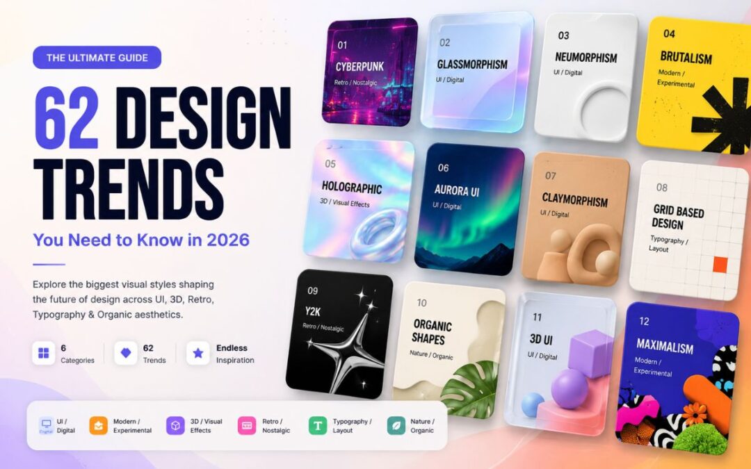
Design Trend Library · 2026
50+ Design Trends
Explore 62 visual styles across UI, experimental design,
3D, retro aesthetics, typography and organic design.
UI Design Trends 2026 to Watch
Glassmorphism – Frosted glass panels, blur, transparency. Still everywhere in 2026. If your app feels “floaty,” this is why.
Neumorphism –Soft shadows that make elements look pressed into the screen. Looks great in mockups, breaks accessibility in real use. Common mistake: using it for buttons people actually need to read fast.
Claymorphism –Neumorphism’s chunkier, more playful cousin. Rounded, puffy, toy-like. Good for kids’ apps and casual products bad for anything “serious.”
Skeuomorphism –Real-world textures (leather, wood, metal) on digital elements. Old-school Apple. Mostly nostalgia now, occasionally makes a comeback for retro apps.
Flat Design –No shadows, no gradients, just clean shapes. Still the safest default if you don’t want to think too much.
Material Design –Google’s system. Flat design plus purposeful shadows and motion. If you’re building an Android app, you’re basically using this whether you know it or not.
Fluent Design –Microsoft’s version. Similar idea, different personality more depth, more light effects.
Liquid Glass –Apple’s 2025-2026 evolution of glassmorphism. More refractive, more physical. Worth watching if you design for iOS.
Aurora UI –Soft gradient backgrounds that shift like the northern lights. Popular for landing pages that want to feel “premium” without saying it.
Bento UI –Grid layout, boxes of different sizes, like a bento box. Huge right now for dashboards and portfolio sites. Simple rule: if you have mixed content types, this fixes your layout headaches.
3D UI –Actual depth, not fake shadows. Needs more dev effort but makes products feel expensive.
Holographic UI –Iridescent, shifting colors like a hologram sticker. Great for Gen Z-facing products, exhausting for anything else.
Spatial UI –Designed for AR/VR, think Vision Pro. If you’re not building for headsets yet, file this away for later.
AI-native UI –Interfaces built around chat, prompts, and generative content instead of fixed screens. This is where most new product design is heading worth learning even if you’re not there yet.
Modern & Experimental Aesthetics
Brutalism –Raw, unstyled, almost ugly on purpose. Big black text, harsh grids. Here’s the truth: it works because it looks like nobody tried, and that reads as “authentic” to some audiences.
Neo-Brutalism –Brutalism with color and personality added back in. This is the version most brands actually use now pure brutalism is too harsh for most products.
Maximalism –More of everything. Color, texture, pattern. Bold bet either your brand has the confidence for it or it doesn’t.
Minimalism –Strip everything down to what’s necessary. Still the safest choice if you’re unsure. My recommendation: start minimal, add personality later it’s easier than removing clutter.
Swiss International Style –Grid-based, clean typography, no decoration. The grandparent of modern minimalism.
Editorial Design –Magazine-style layouts big type, generous whitespace, storytelling first. Great for blogs and content-heavy sites.
Organic Modernism –Clean lines but with natural curves and warmth. Minimalism that doesn’t feel cold.
Abstract Geometry –Shapes doing the visual heavy lifting instead of images. Cheap to produce, still looks intentional.
Deconstructed Design –Layouts that look “broken” on purpose overlapping elements, misaligned grids. High risk, high personality.
Anti-Design –Deliberately rejects design rules. Basically brutalism’s rebellious cousin. Not for beginners.
3D & Visual Effects
Isometric Design – Fake 3D at a fixed angle. Popular for explainer illustrations and infographics.
Low-Poly 3D – Simple geometric 3D shapes, faceted look. Fast to render, still looks modern.
Hyperreal 3D – Photorealistic 3D renders. Needs real production budget, but nothing beats it for product visuals.
Chrome / Liquid Metal – Shiny, reflective, metallic surfaces. Been trending hard in 2025-2026, you’ve seen it in a hundred app icons already.
Holographic – Same idea as Holographic UI, but applied to visuals and illustration rather than interface.
Iridescent – Color-shifting surfaces, oil-slick effect. Pairs well with chrome and glass.
Glass 3D – 3D objects rendered like glass. The “liquid glass” trend’s visual sibling.
Paper Cut – Layered paper-style illustration, soft shadows between layers. Warm, tactile, great for storytelling content.
Inflatable 3D – Puffy, balloon-like 3D shapes. Playful, brand-forward, hard to take seriously in B2B.
Toy-like 3D – Cute, rounded, plastic-toy aesthetic. Works if your brand is fun-first.
Retro & Nostalgic Styles
Y2K – Late-90s/early-2000s tech optimism. Chrome text, bubble fonts, gradients. Back in a big way with Gen Z.
Frutiger Aero – Glossy, nature-meets-tech look from mid-2000s (think old Windows Vista). Having a real nostalgia moment right now.
Vaporwave – Pink-purple gradients, glitch art, 80s mall aesthetics. More of a mood than a UI system.
Retro Futurism – How the past imagined the future. Chrome rockets, bold optimism.
Cyberpunk – Neon on dark backgrounds, glitch effects, dystopian tech vibe. If your product touches gaming or crypto, this is probably already your Pinterest board.
Retro Editorial – Old print magazine styling brought into digital think 70s typefaces and grain textures.
Typography & Layout Trends
Kinetic Typography – Text that moves. Great for video and motion-heavy landing pages.
Oversized Typography – Massive headlines that dominate the screen. If you don’t want to think too much: bigger text usually means better first impressions.
Experimental Typography – Type that breaks rules overlapping, distorted, unconventional. High risk, needs a confident brand.
Variable Typography – Fonts that adjust weight/width dynamically. More of a technical trend than visual but it’s what makes responsive type actually look good.
Typography-as-Image – Letters shaped to form images or icons. Clever, but easy to overdo.
Grid-Based Design – Everything aligned to a strict grid. The backbone of most “clean” design you’re probably already using this without naming it.
Collage Design – Mixed media, cut-and-paste feel. Popular in editorial and fashion-adjacent brands.
Layered Typography – Overlapping text blocks for depth. Bold move, works best in hero sections.
Type Distortion – Warped, stretched, or glitched letterforms. Mostly for music/gaming brands wanting edge.
Botanical Design – Plant and floral motifs. Popular for wellness, beauty, lifestyle brands.
Earthy Minimalism – Minimalism with warm, natural tones instead of stark white/black.
Natural Texture – Wood grain, linen, stone textures used digitally. Adds warmth fast.
Biophilic Design – Nature-inspired design meant to feel calming more common in physical spaces, growing in digital too.
Which UI Design Trend Should You Actually Use?
If I had to recommend one thing – don’t chase every trend on this list.Simple rule: pick one aesthetic that fits your brand, master it, then borrow one or two accents from another category. Trying to use ten of these at once is how you end up with a homepage that looks like a mood board threw up.
FAQs
What’s the most popular UI design trend in 2026?
Glassmorphism and its newer form, liquid glass, are still dominating UI design right now – especially on iOS and premium web products.
Which design aesthetic is best for beginners?
Flat design or minimalism. Both are forgiving, timeless, and hard to get badly wrong.
Are these design trends useful for AI-generated design work?
Yes – naming a specific aesthetic (like “neo-brutalism” or “bento UI”) in an AI prompt gets far more consistent, intentional results than vague terms like “modern” or “clean.”
How many IJI design trends 2026 should I actually know?
You don’t need all 60+. Pick 5-6 UI design trends 2026 that fit your niche and go deep on those – trying to track every single one is how designers end up copying instead of creating.
Will these Ul design trends 2026 still be relevant next year?
Some will, some won’t. Foundational ones like flat design, minimalism, and grid-based layouts barely move year to year. Flashier ones – Y2K, vaporwave, chrome – cycle in and out faster, so treat those as seasonal accents, not your whole identity.
How do I pick the right UI design trend 2026 for my brand?
Simple rule: match the aesthetic to your audience’s energy, not your personal taste. A fintech app copying cyberpunk UI design trends 2026 confuses people, a gaming brand going full minimalism does the same. Start with what your users expect, then add personality on top.