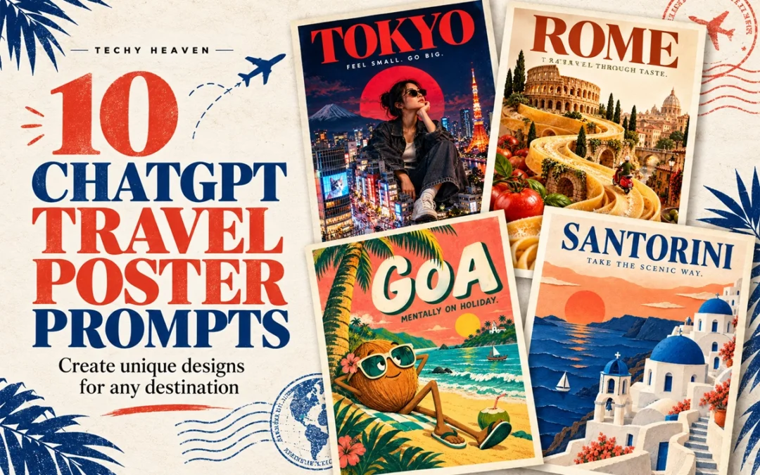
Travel posters do not have to follow the same predictable layout. With the right ChatGPT travel poster prompts, one destination can be transformed into a surreal miniature city, a brutalist collage, a cinematic night scene or even a handcrafted paper world.
Below are ten creative poster directions you can customise for any city, country or landmark.
In This Post
How to Use These Travel Poster Prompts
Replace [PLACE NAME] with your chosen destination and paste the prompt into ChatGPT.
For Instagram posts and digital posters, ask for a vertical 4:5 composition. You can also change the tagline, colours, typography and landmarks.
1. Giant Tourist, Tiny City
LOCATION: [PLACE NAME]
Create a surreal travel poster featuring a giant stylish traveller sitting among this destination’s miniature landmarks and streets. Use realistic photographic collage, playful scale, bold editorial typography, and colours inspired by the place. Add the location name and “FEEL SMALL. GO BIG.” Vertical composition, premium finish, no extra text or mockup.
2. Destination Inside Typography
LOCATION: [PLACE NAME]
Create a typography-led travel poster with the location name in massive lettering. Integrate recognisable local landscapes inside the letters, with a few elements breaking beyond their edges. Use a clean background, a refined colour palette, and generous negative space. Make the word clearly readable. Vertical composition, no extra text or mockup.
3. Boarding Pass Poster
LOCATION: [PLACE NAME]
Design a travel poster as an oversized boarding pass with the location name as the main destination. Include subtle perforations, travel stamps, route graphics, and one striking photograph of a local landmark. Use precise ticket-style typography, warm paper texture, and one bold accent colour. Add “DESTINATION: SOMEWHERE NEW.” Vertical layout, minimal supporting details, no mockup.
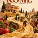
4. Travel Through Taste
LOCATION: [PLACE NAME]
Create a surreal travel poster where a signature local dish transforms into the destination’s landscape, with miniature landmarks integrated into the food. Use appetising realistic textures, an unexpected composition, and a clean studio background. Add elegant bold typography with the location name and “TRAVEL THROUGH TASTE.” Vertical layout, no extra text or mockup.
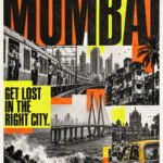
5. Loud City, Loud Poster
LOCATION: [PLACE NAME]
Create a bold brutalist travel poster using authentic local street photography, oversized stretched typography, gritty textures, and sharp overlapping colour blocks. Combine monochrome imagery with one fluorescent accent. Make the location name dominant and add “GET LOST IN THE RIGHT CITY.” Controlled visual chaos, strong readability, vertical layout, no mockup.
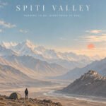
6. The Quietest View
LOCATION: [PLACE NAME]
Create a minimalist travel poster showing one tiny traveller within an expansive, recognisable landscape of this destination. Use soft pastel colours, atmospheric light, subtle grain, and generous negative space. Pair the location name with small elegant typography reading “NOTHING TO DO. EVERYTHING TO FEEL.” Calm, premium vertical composition, no extra elements or mockup.
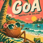
7. Odd Travel Character
LOCATION: [PLACE NAME]
Create a quirky illustrated travel poster starring an eccentric character inspired by this destination’s landscape, food, or landmark. Give it exaggerated proportions, expressive eyes, and unexpected travel accessories. Use playful typography, bold flat colours, and subtle print texture. Include the location name and “MENTALLY ON HOLIDAY.” Vertical layout, distinctive character design, no mockup.
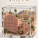
8. Destination in a Glass Box
LOCATION: [PLACE NAME]
Create a travel poster featuring an intricate miniature version of this destination inside a transparent glass cube. Include recognisable landmarks, local terrain, tiny streets, and atmospheric details. Use realistic materials, soft studio lighting, and a clean background. Add the location name with refined museum-label typography and “A WHOLE WORLD WITHIN.” Vertical layout, no mockup.
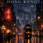
9. After Dark
LOCATION: [PLACE NAME]
Create a cinematic travel poster showing this destination after dark, with authentic local architecture, atmospheric shadows, and luminous reflections. Use deep indigo tones with restrained warm or neon accents. Compose it like an independent film poster, with elegant typography displaying the location name and “STAY FOR THE NIGHT.” Vertical layout, no extra text or mockup.
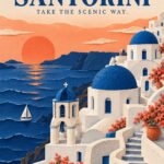
10. Paper World
LOCATION: [PLACE NAME]
Create a handcrafted paper-cut travel poster depicting this destination’s iconic landmarks and landscape through layered coloured paper. Use tactile edges, subtle paper grain, realistic soft shadows, and a limited palette of three complementary colours. Integrate the location name into the composition and add “TAKE THE SCENIC WAY.” Premium vertical layout, no extra text or mockup.
The Six-Part Prompt Formula
When creating your own ChatGPT image prompt, remember this structure:
Mention specific landmarks instead of requesting an entire city.
Limit the design to two or three main colours.
Keep poster text short and clearly specify the exact wording.
Ask for clean margins and a strong typography hierarchy.
Generate a few versions before selecting the final composition.
If the text is incorrect, request a targeted typography correction.
Frequently Asked Questions
Can I use these prompts for any destination?
Yes. Replace the location placeholder and add details associated with your chosen city, country, island or landmark.
What image size should I use?
A vertical 4:5 format works well for Instagram carousel posts. For printing, generate the artwork at the highest available resolution.
Can ChatGPT add text to travel posters?
Yes, but you should provide the exact text inside quotation marks. Always check the final spelling before publishing or printing.
Which travel poster style should I try first?
Start with the destination-inside-typography or minimalist landscape concept. Both work with a wide range of locations and are easy to customise.
These ten ChatGPT travel poster prompts are starting points. Change the destination, visual metaphor, colours and art direction to create a travel-poster collection that feels completely your own.
Start by replacing the location with the destination you want to showcase.
For example:
Bali
Tokyo
Delhi
New York
Santorini
Istanbul
Paris
Dubai
London
Singapore
The Complete AI Travel Poster Prompt
Prompt Card
01
AI Image Prompt
Premium Travel Poster
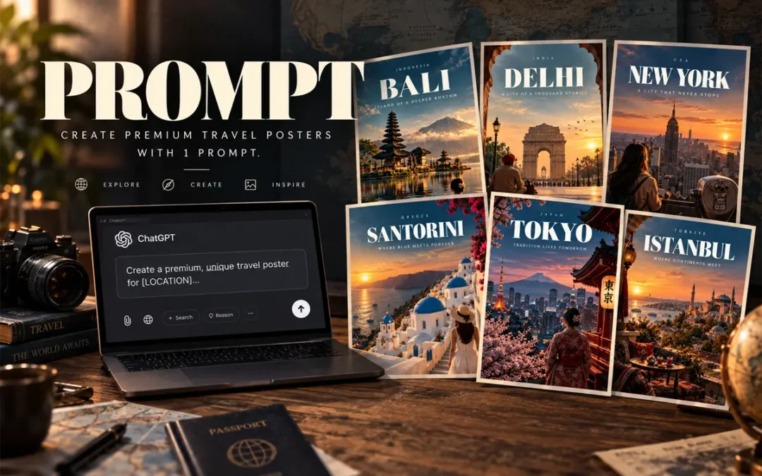
Create image of a premium, unique travel poster for [LOCATION]. Capture its most iconic landscape, architecture, culture, or atmosphere in a cinematic, editorial style. Use bold, sophisticated typography with [LOCATION] as the main title, supported by a short destination-specific tagline. Strong composition, dramatic perspective, refined color palette, realistic details, subtle film grain, luxury travel-magazine aesthetic, print-ready, visually striking, minimal clutter, professional art direction. Avoid generic stock-photo styling and excessive text. –ar 4:5
You can now combine everything into one reusable template:
Create image of a premium, unique travel poster for [LOCATION]. Capture its most iconic landscape, architecture, culture, or atmosphere in a cinematic, editorial style. Use bold, sophisticated typography with [LOCATION] as the main title, supported by a short destination-specific tagline. Strong composition, dramatic perspective, refined color palette, realistic details, subtle film grain, luxury travel-magazine aesthetic, print-ready, visually striking, minimal clutter, professional art direction. Avoid generic stock-photo styling and excessive text. –ar 4:5
Simply replace [LOCATION] with your destination.
Quick Formula to Remember
If you want to create your own prompts quickly, remember:
Open ChatGPT + Paste Prompt + Replace Location placeholder with your Destination + Submit
That’s enough to build a strong starting point.
The result should look less like an AI-generated image and more like a luxury travel magazine cover.
Frequently Asked Questions
What is the best AI travel poster prompt?
The best AI travel poster prompt combines a specific destination, recognizable visual story, cinematic photography direction, typography hierarchy, composition, color palette and finishing details.
Can I use this prompt for any destination?
Yes. Replace the location and adapt the visual story to the destination. The same framework works for cities, countries, islands and tourist destinations.
What aspect ratio should I use for travel posters?
A 4:5 vertical format works particularly well for social media posts, carousel designs and digital travel campaigns.
How do I make an AI travel poster look more realistic?
Use specific environmental details, natural lighting, realistic textures, atmospheric depth, photographic composition and subtle film grain. Avoid stuffing the prompt with too many landmarks.
How much text should a travel poster contain?
Keep it minimal. A strong hierarchy usually needs only the country, destination name and a short tagline, with optional small supporting text.
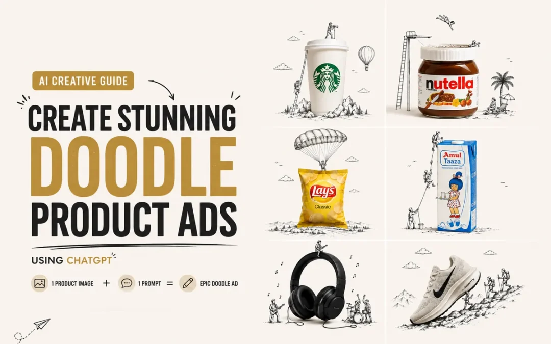
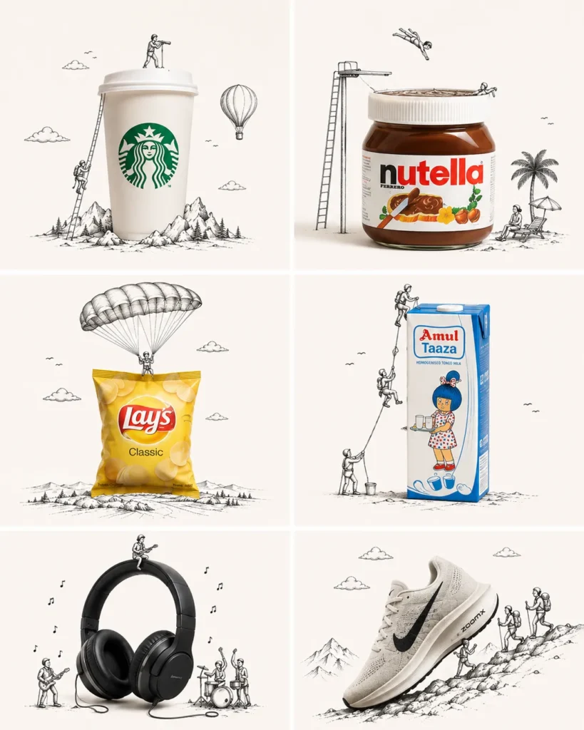
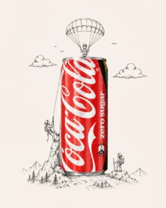
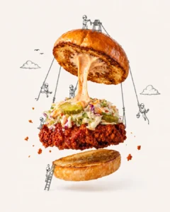
Want to turn a simple product photo into a creative advertising visual like this? You can create the entire concept using one product image + one master prompt in ChatGPT.
You can experiment with almost anything—food, beverages, shoes, headphones, cosmetics, packaging, gadgets, etc.
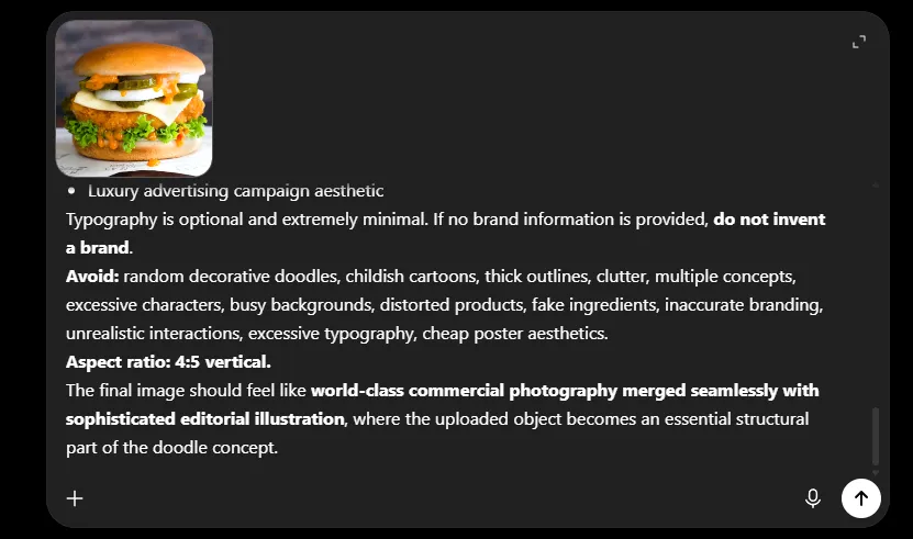
Step 3: Add the Master Prompt
Paste the doodle creative prompt along with your uploaded image.
Create Doodle Product Ads
Use the uploaded product or food image as the exact hero reference.

Create an ultra-premium minimalist 4:5 advertising poster combining the real, hyper-realistic uploaded object with an elegant black-and-white hand-drawn doodle illustration.

Creative Concept

First analyze the uploaded object’s shape, silhouette, orientation, function, texture, and distinctive features. Then invent ONE clever visual metaphor specifically inspired by it.

Imagine: “What could this object become inside a tiny illustrated world?”

It could naturally function as a parachute, vehicle, mountain, boat, building, flying machine, playground, landscape, tool, planet, bridge, etc.—but do not force these examples. Create an original idea that best fits the specific object.

Most Important Rule

The doodle must physically interact with the real object, not simply decorate the space around it.

Tiny hand-drawn characters may climb, ride, hang from, fly with, build on, push, pull, sail, explore, or otherwise use the object.

REAL OBJECT + DOODLE = ONE COMPLETE VISUAL IDEA.

Make the interaction clever, instantly understandable, physically believable, witty, and sophisticated.

Product Accuracy

Keep the uploaded object photorealistic and recognizable. Preserve its original shape, proportions, colors, materials, textures, branding, packaging, and important details.

For food, preserve authentic texture and ingredients while making it extremely fresh and appetizing.

Visual Style

Hyper-realistic premium product/food photography
Thin, refined black-ink hand-drawn illustration
Tiny elegant illustrated characters
Warm white / pale neutral background
Generous negative space
Soft premium studio lighting
Subtle realistic shadows
Minimal editorial composition
One hero object
One strong doodle concept
Intelligent, poetic humor
Luxury advertising campaign aesthetic

Typography is optional and extremely minimal. If no brand information is provided, do not invent a brand.

Avoid: random decorative doodles, childish cartoons, thick outlines, clutter, multiple concepts, excessive characters, busy backgrounds, distorted products, fake ingredients, inaccurate branding, unrealistic interactions, excessive typography, cheap poster aesthetics.

Aspect ratio: 4:5 vertical.

The final image should feel like world-class commercial photography merged seamlessly with sophisticated editorial illustration, where the uploaded object becomes an essential structural part of the doodle concept.
If above “copy prompt” button not working then here is plain prompt text below
Use the uploaded product or food image as the exact hero reference.

Create an ultra-premium minimalist 4:5 advertising poster combining the real, hyper-realistic uploaded object with an elegant black-and-white hand-drawn doodle illustration.

Creative Concept

First analyze the uploaded object’s shape, silhouette, orientation, function, texture, and distinctive features. Then invent ONE clever visual metaphor specifically inspired by it.

Imagine: “What could this object become inside a tiny illustrated world?”

It could naturally function as a parachute, vehicle, mountain, boat, building, flying machine, playground, landscape, tool, planet, bridge, etc.—but do not force these examples. Create an original idea that best fits the specific object.

Most Important Rule

The doodle must physically interact with the real object, not simply decorate the space around it.

Tiny hand-drawn characters may climb, ride, hang from, fly with, build on, push, pull, sail, explore, or otherwise use the object.

REAL OBJECT + DOODLE = ONE COMPLETE VISUAL IDEA.

Make the interaction clever, instantly understandable, physically believable, witty, and sophisticated.

Product Accuracy

Keep the uploaded object photorealistic and recognizable. Preserve its original shape, proportions, colors, materials, textures, branding, packaging, and important details.

For food, preserve authentic texture and ingredients while making it extremely fresh and appetizing.

Visual Style

Hyper-realistic premium product/food photography
Thin, refined black-ink hand-drawn illustration
Tiny elegant illustrated characters
Warm white / pale neutral background
Generous negative space
Soft premium studio lighting
Subtle realistic shadows
Minimal editorial composition
One hero object
One strong doodle concept
Intelligent, poetic humor
Luxury advertising campaign aesthetic

Typography is optional and extremely minimal. If no brand information is provided, do not invent a brand.

Avoid: random decorative doodles, childish cartoons, thick outlines, clutter, multiple concepts, excessive characters, busy backgrounds, distorted products, fake ingredients, inaccurate branding, unrealistic interactions, excessive typography, cheap poster aesthetics.

Aspect ratio: 4:5 vertical.

The final image should feel like world-class commercial photography merged seamlessly with sophisticated editorial illustration, where the uploaded object becomes an essential structural part of the doodle concept.
The prompt tells ChatGPT to:
Keep the real product photorealistic
Analyze its shape and structure
Invent a visual metaphor around it
Add tiny hand-drawn characters
Make the doodles physically interact with the product
Create a premium minimalist advertising composition
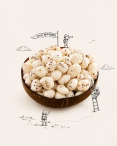
For example, a shoe might become a mountain for hikers, a jar could become a swimming pool, or a product pack could become part of a tiny adventure world.
Step 4: Generate Your Creative
Ask for a 4:5 vertical poster if you’re creating content for Instagram.
The key idea is:
REAL PRODUCT + DOODLE WORLD = ONE VISUAL STORY
Avoid doodles that are simply floating around the product. The illustration should actually climb, use, ride, build on, hang from, or interact with the product.
Step 5: Experiment
Don’t stop at the first generation. Upload different products using the same master prompt.
You can also ask ChatGPT:
“Create another concept, but use a completely different visual metaphor and keep the product unchanged.”
This makes it easy to turn one technique into an entire creative series.
Get More AI Creative Prompts
Want more AI prompts for product ads, posters, photography, and creative visuals?
Follow @thesaurabhsource on Instagram for new prompts, creative ideas, and AI experiments.
FAQs
What are AI Doodle Product Ads?
AI Doodle Product Ads combine a realistic product photo with hand-drawn illustrations to turn the product into part of a creative visual story.
How can I create doodle product ads with ChatGPT?
Upload your product image to ChatGPT, paste the master doodle prompt, and ask it to create a 4:5 advertising creative.
Do I need design or prompting skills?
No. A clear product image and the master prompt are enough to get started. You can refine the generated concept with simple follow-up instructions.
What products can I use?
You can experiment with food, beverages, shoes, gadgets, cosmetics, packaging, fashion products, accessories, and more.
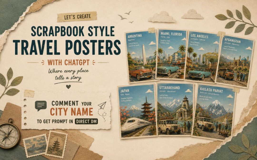
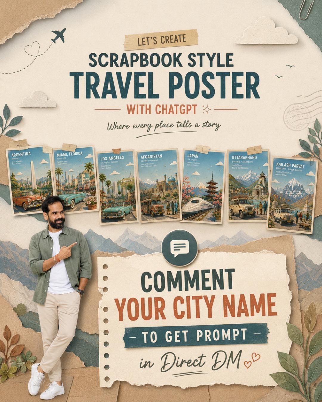
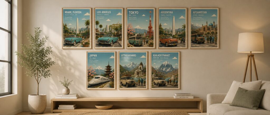
Turn any city, country, or landmark into a premium storybook-style travel poster in less than a minute.
In This Post
Master Prompt
Copy the complete prompt below into ChatGPT (GPT Image). Replace only the text inside [LOCATION NAME] and generate your image in 4:5 aspect ratio.
Travel Poster Ver – 4.0
Create a premium 4:5 travel-poster illustration of [LOCTAION NAME] in a whimsical storybook paper-collage style. The artwork should feel like a handcrafted layered paper diorama, blending the charm of a classic children's picture book with the sophistication of a Scandinavian editorial travel poster. It should be a collectible destination print suitable for museum gift shops, boutique hotels, luxury travel publications, and modern interiors.

Depict the location using one iconic transportation vehicle and one primary landmark as the two unmistakable visual anchors. The vehicle should occupy approximately 35–40% of the foreground, simplified into elegant paper-cut forms while remaining instantly recognizable. Surround it sparingly with a few flower planters, one bench, two or three tiny pedestrians, a cyclist, a street lamp, and subtle local urban details. Keep the foreground clean and uncluttered.

The midground should feature simplified local architecture, streetscape, greenery, parks or waterfronts, and subtle cultural elements, all reduced to clean geometric shapes with minimal architectural detail. In the background, feature only one hero landmark, supported by one or two secondary landmarks that are softened into atmospheric paper layers. If appropriate, distant mountains or natural scenery should fade gently into the horizon. Every architectural element should read as a simplified silhouette rather than a detailed building.

Compose the illustration with an expansive open sky occupying approximately 50–55% of the image, creating generous breathing room and strong negative space. Include two to five rounded paper clouds, a few tiny birds, and a soft pastel gradient with visible handmade paper grain. Establish clear foreground, midground, atmospheric haze, and background layers using crisp stacked paper sheets with visible cut edges, subtle elevation, delicate cast shadows, and tactile cardstock textures.

Adopt a soft, harmonious color palette featuring sky blue, warm cream, light beige, pale stone gray, muted sage green, powder mint, dusty coral, soft peach, off-white, plus one distinctive accent color inspired by the location. Maintain restrained saturation throughout the composition, allowing only the iconic vehicle and primary landmark to carry slightly richer color emphasis while the remaining scene stays gently muted.

Use bright morning daylight with soft ambient illumination, subtle shadows, clean air, and a warm optimistic atmosphere. Shapes should be rounded, friendly, and organic with softly curved trees, fluffy clouds, stylized foliage, rolling hills where appropriate, and charming handcrafted imperfections that reinforce the storybook aesthetic.

In the upper-left corner, integrate elegant white rounded geometric sans-serif typography into the open sky using a clean editorial grid with generous margins. Display:

- [LOCATION NAME]
- [LOCAL LANGUAGE NAME] · [ENGLISH NAME]
- A unique location-specific tagline that reflects the city's identity while keeping the same elegant typographic style across the entire poster series (examples: "Where Tradition Meets Tomorrow", "The City of Timeless Canals", "Gateway to the Himalayas", "Where History Breathes", "Island of Endless Horizons").

Finish with a thin warm-cream border around the artwork, subtle museum-print paper texture, and a refined collectible poster aesthetic inspired by Scandinavian design, Kinfolk editorial layouts, Monocle travel illustrations, and mid-century European tourism posters.

Mood: peaceful, nostalgic, whimsical, timeless, joyful, slow-travel, refined, cultured, optimistic, quietly magical.

Avoid photorealism, CGI, glossy materials, excessive architectural detail, heavy outlines, cluttered compositions, crowded streets, readable advertisements, brand logos, watermarks, neon colors, cyberpunk aesthetics, dark lighting, dramatic contrast, busy signage, or tourist-brochure styling.

The final result should feel like a handcrafted premium destination poster with a consistent visual identity across every city, where the iconic vehicle, hero landmark, expansive sky, tactile paper layers, editorial typography, and location-specific tagline create an instantly recognizable collectible travel series.
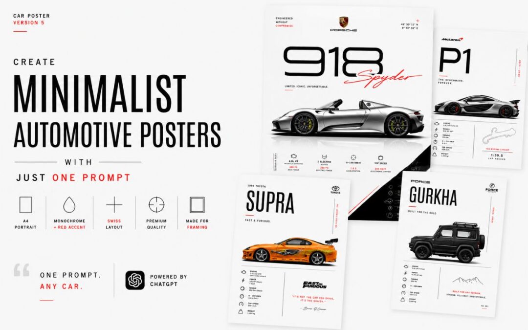
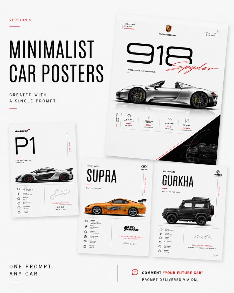
Create Premium Car Posters with a Single AI Prompt
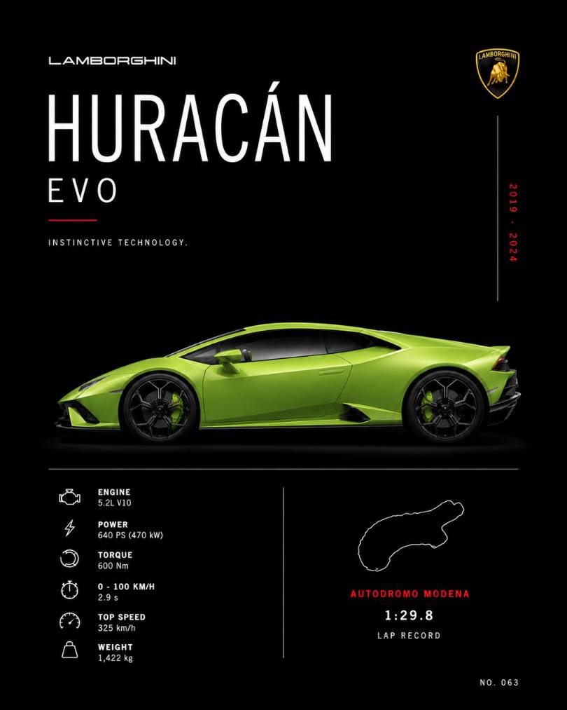
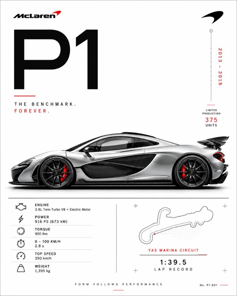
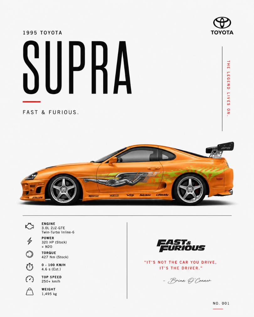
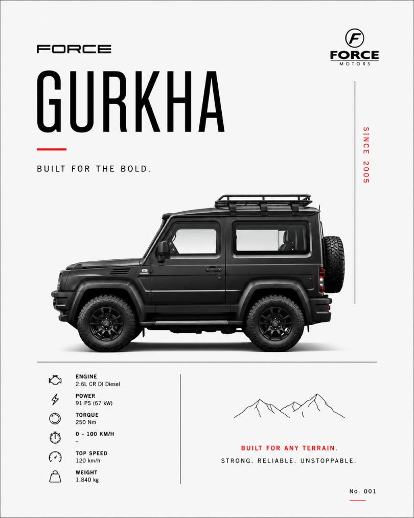
Whether you love Porsche, McLaren, Lamborghini, Toyota Supra, Nissan GT-R, Force Gurkha, or any other vehicle, this method can turn almost any car into a museum-quality poster design.
In this guide, I’ll show you exactly how I created these posters and how you can make your own in minutes.
Here is the Prompt:
Minimalist Automotive Poster Prompt
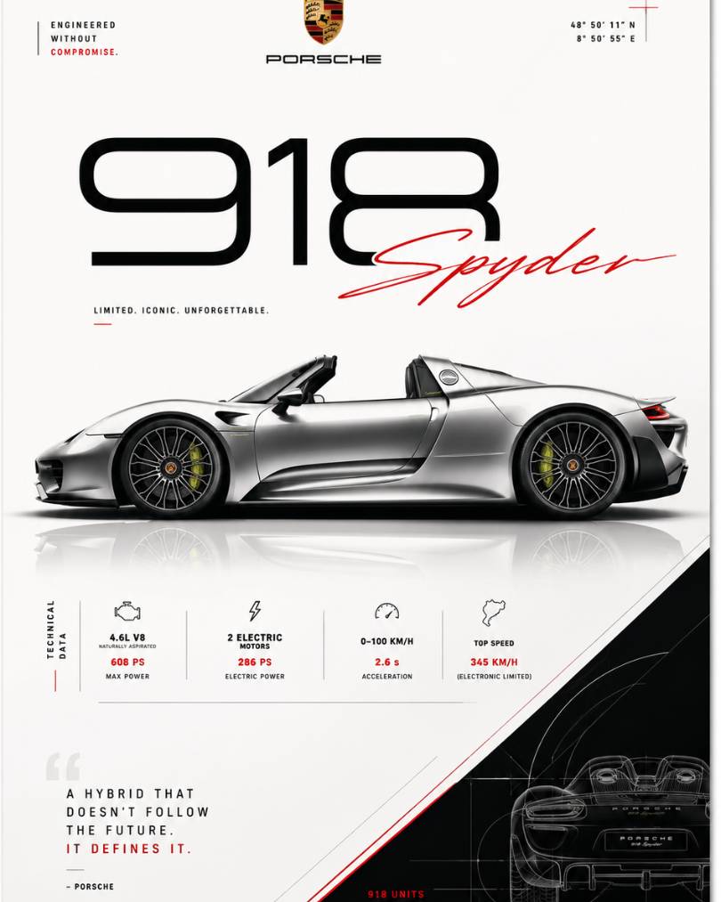
Minimalist automotive poster design in A4 portrait format for [CAR NAME]. A modern sports car shown in a clean side profile silhouette, premium automotive wall art aesthetic, vast negative space, monochrome black and white color scheme with a single red accent. Elegant Swiss-inspired layout, subtle technical specifications, thin geometric lines, refined typography, museum-quality print design, ultra-clean composition, luxury automotive branding style, high-end poster suitable for framing, professional graphic design, vector-inspired precision, premium paper print look.
Simplified Prompt – If above Copy Prompt button not working then Select and Copy Below Prompt
Prompt:
Minimalist automotive poster design in A4 portrait format for [CAR NAME]. A modern sports car shown in a clean side profile silhouette, premium automotive wall art aesthetic, vast negative space, monochrome black and white color scheme with a single red accent. Elegant Swiss-inspired layout, subtle technical specifications, thin geometric lines, refined typography, museum-quality print design, ultra-clean composition, luxury automotive branding style, high-end poster suitable for framing, professional graphic design, vector-inspired precision, premium paper print look.
What Is a Minimalist Automotive Poster?
A minimalist automotive poster is a clean and modern artwork that focuses on:
Side profile of a car
Premium typography
Technical specifications
Large negative space
Swiss-inspired design layout
Luxury wall-art appearance
Mountain Escape
Explore breathtaking landscapes
Ocean Vibes
Relax by the sea
Adventure
Discover hidden places
Nature
Reconnect with the outdoors
Dream Destination
Create unforgettable memories
These posters look great as:
Wall decor
Garage artwork
Desktop wallpapers
Social media content
Gifts for car enthusiasts
Examples of Cars You Can Create
This prompt works for almost any vehicle.
Examples include:
Porsche 918 Spyder
Porsche 911
McLaren P1
McLaren W1
Lamborghini Huracán
Nissan GT-R R35
Toyota Supra MK4
Force Gurkha
BMW M4
Ferrari F40
Bugatti Chiron
Ford Mustang
Simply replace the car name inside the prompt.
The One Prompt That Creates Everything
Replace [CAR NAME] with any vehicle.
Example:
Porsche 918 Spyder
McLaren P1
Toyota Supra MK4
Force Gurkha
The AI will automatically generate a premium poster concept based on that vehicle.
Why This Prompt Works So Well
Most AI image prompts fail because they are too vague.
This prompt works because it clearly defines:
Layout
The prompt asks for:
A4 portrait format
Clean composition
Side profile vehicle view
Professional graphic design structure
Design Style
The prompt specifies:
Swiss design principles
Minimalist layout
Luxury automotive branding
Museum-quality poster appearance
Visual Consistency
The prompt keeps:
Black and white palette
Single red accent
Thin geometric lines
Technical specifications
Premium typography
This creates a consistent poster series.
Best AI Models for This Prompt
You can use:
ChatGPT Image Generation
Perfect for creating premium poster layouts directly.
Gemini
Excellent for clean graphic compositions.
Nano Banana
Great for highly detailed automotive renders.
Midjourney
Strong artistic and print-quality results.
Flux
Good for realistic automotive visuals.
How to Turn It Into a Poster Collection
Create a complete automotive wall-art series.
For example:
Supercar Collection
Porsche 918 Spyder
McLaren P1
Ferrari LaFerrari
Lamborghini Revuelto
JDM Collection
Supra MK4
Nissan GT-R R34
Mazda RX-7
Honda NSX
Off-Road Collection
Force Gurkha
Jeep Wrangler
Land Rover Defender
Toyota Land Cruiser
All posters will maintain a matching visual style.
With one well-structured prompt and ChatGPT, you can generate premium automotive wall art featuring your favorite cars in seconds.
The best part?
You only need to change one thing:
The car name.
Everything else remains consistent, professional, and ready for sharing, printing, or selling.
If you’re a car enthusiast, designer, or content creator, this is one of the easiest ways to build a stunning automotive poster collection using AI.
FAQ
Can I use this prompt for any car?
Yes. Simply replace the placeholder with any car model, and the design style remains consistent.
Can I sell posters created with this prompt?
That depends on the image generation platform’s commercial usage terms. Always check the licensing rules of the AI tool you use.
Which car works best with this prompt?
Performance and iconic cars such as Porsche 918 Spyder, McLaren P1, Toyota Supra MK4, Lamborghini Huracán, and Nissan GT-R generally produce the strongest results.
Do I need graphic design experience?
No. The prompt handles the layout, typography, and overall design direction automatically.
If you’ve ever wanted to create those insanely good-looking automotive posters you see on Instagram, you’re in the right place.
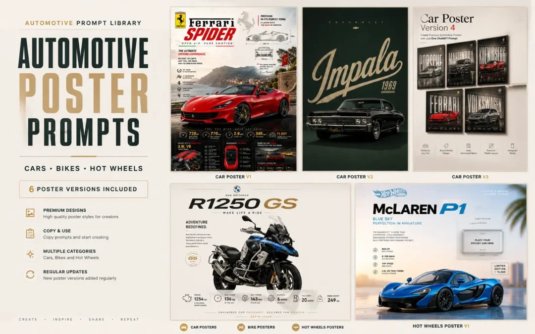
This page is where I keep all my automotive poster prompt versions in one place.
Right now you’ll find car posters, bike posters, and Hot Wheels poster prompts, and I’ll keep adding new versions whenever I create something worth sharing.
Just pick a poster style, copy the prompt, and start creating.
These are the poster versions available right now.
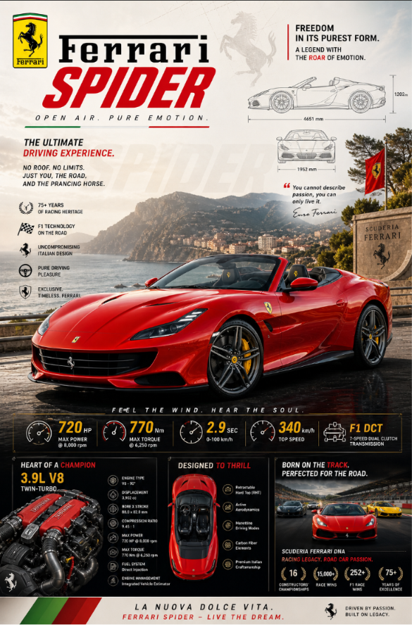
Automotive Poster Ver-1.0
Create an epic premium automotive poster of super[CAR NAME]. Place the car as the heroic central subject in a dynamic three-quarter side profile, visually dominant and impossible to ignore. Show the full beauty of the vehicle with aggressive stance, perfect proportions, premium wheels, signature headlights, aerodynamic lines, spoilers, performance details, and luxury design language. ar 9:16

Add bold premium typography with the brand name, model name, performance stats, horsepower, acceleration, top speed, engine specs, and iconic achievements beautifully integrated into the composition. Include subtle background elements inspired by the car’s heritage: faded blueprint lines, racing legacy, silhouette overlays, iconic tracks, engineering details, speed graphics, and collector-poster aesthetics.

Use strong visual contrast, bright premium colors (avoid dark black-heavy backgrounds), cinematic lighting, ultra-detailed reflections, glossy paint finish, luxury magazine quality, modern graphic design, and scroll-stopping masterpiece energy. Clean composition, high-end automotive advertisement style, collector poster aesthetic, highly detailed, visually powerful, premium masterpiece.
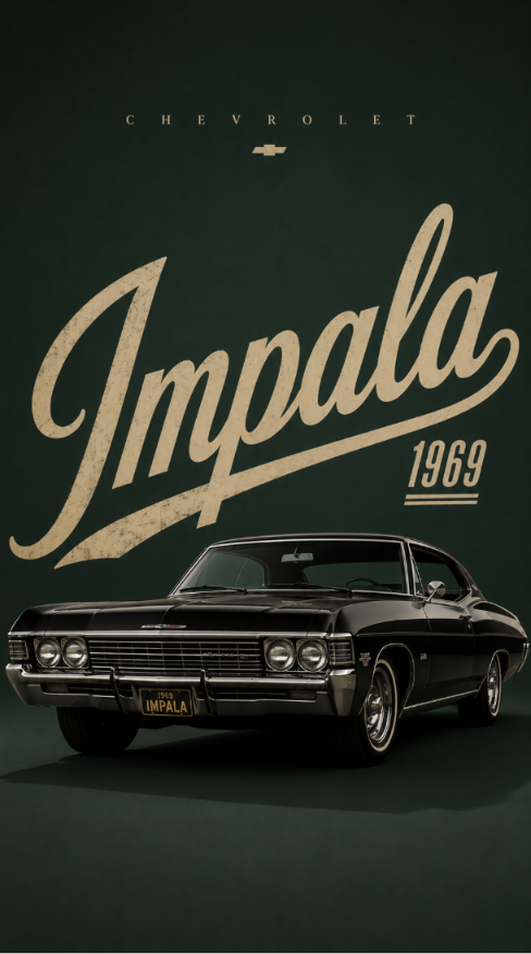
Automotive Poster Ver-2.0
Create a premium minimalist automotive poster for [CAR NAME / MODEL], inspired by luxury editorial car advertisements.

Use a clean vertical 9:16 Instagram Reels/Story composition with a bold solid color background in [BACKGROUND COLOR]. The background color should match the car’s personality, brand identity, era, and mood.

Place the car as the main subject in the lower-middle area. The car should look realistic, premium, sharp, glossy, and detailed, with accurate proportions, clean reflections, crisp edges, studio-quality lighting, and a natural shadow under the vehicle.

Behind the car, add huge oversized typography showing the car model name: “[BIG WORD]”.

Typography Direction:
Choose a typography style that matches the personality, era, and design language of the car. Do not use the same tall bold font every time.

Randomly select or intelligently choose one typography style:
- Tall condensed bold font for luxury sedans, SUVs, and classic premium cars
- Wide futuristic font for hypercars, EVs, and concept cars
- Aggressive sharp angular font for sports cars and performance cars
- Retro serif or vintage poster font for classic cars
- Elegant thin luxury serif font for premium luxury cars
- Creative cursive/script font for stylish lifestyle cars or heritage editions
- Glitch/distorted digital font for cyberpunk, electric, futuristic, or modified cars
- Rugged industrial stencil font for off-road SUVs and adventure vehicles
- Racing decal-style typography for track cars, rally cars, and supercars
- Minimal clean geometric sans-serif for modern EVs and clean luxury cars

The large background typography should feel unique to the car, not generic. It may be oversized, stretched, stacked, angled, partially cropped, transparent, outlined, embossed, shadowed, layered, or blended into the background depending on the car theme.

Add small spaced-out brand text at the top: “[BRAND NAME]”. Keep enough empty space at the top and sides for a clean premium layout.

Style: luxury automotive poster, minimalist editorial layout, high-end car magazine aesthetic, realistic car render, clean shadow, bold color contrast, premium typography, no extra objects, no people, no clutter.
Automotive Poster Ver-3.0
Generate image
Cinematic automotive billboard poster featuring [CAR MODEL NAME] as the hero vehicle.

Analyze the vehicle's design language, brand heritage, segment, performance character, luxury positioning, and visual identity. Automatically determine the most suitable paint color, finish, environment, camera angle, lighting, typography, materials, and color grading.

Position the vehicle center-frame with a dominant presence and premium advertising composition. Automatically select the camera angle that best showcases the vehicle's proportions and character.

Apply world-class automotive lighting with:

• soft cinematic key lights
• controlled rim lighting
• premium reflection shaping
• deep contrast
• realistic paint microtexture

Avoid excessive light streaks, lens flares, neon effects, or distracting visuals.

Create an environment that naturally reflects the vehicle's identity:

• Supercars → dramatic performance architecture
• Sports Cars → premium automotive-inspired industrial settings
• Luxury Sedans → elegant modern architecture
• SUVs → rugged landscapes and adventure scenery
• EVs → futuristic minimal environments
• Off-Road Vehicles → wild natural terrain

Massive billboard-style typography featuring the manufacturer's name in ultra-condensed white lettering integrated into the background architecture. Typography should span edge-to-edge behind the vehicle with subtle divider lines, premium execution, and no distortion.

Use premium architectural wall panels, geometric divisions, brushed metal, concrete, or showroom-inspired surfaces instead of aggressive light bars.

Add a sleek editorial specification strip along the bottom containing 5–8 premium vehicle details. Minimal typography, thin divider lines, luxury watch-catalog aesthetics.

Ground surface should be selected automatically and feature subtle controlled reflections.

Atmospheric effects such as haze, mist, smoke, or volumetric depth should be used only when they enhance the scene.

Place the manufacturer's logo subtly in the top-right corner with small uppercase text:

STRICT RULES

— no taglines
— no marketing copy
— no pricing
— no people
— no random props
— no license plate text
— no oversized specifications
— no excessive light streaks or neon effects

Render as hyper-realistic automotive photography with ultra-sharp details, physically accurate reflections, cinematic color grading, premium advertising quality, and award-winning automotive campaign aesthetics.

Composition must feel balanced, symmetrical, timeless, and worthy of a global automotive billboard campaign.

Format: 4:5 (1080X1350), ultra-high resolution, print-ready finish.
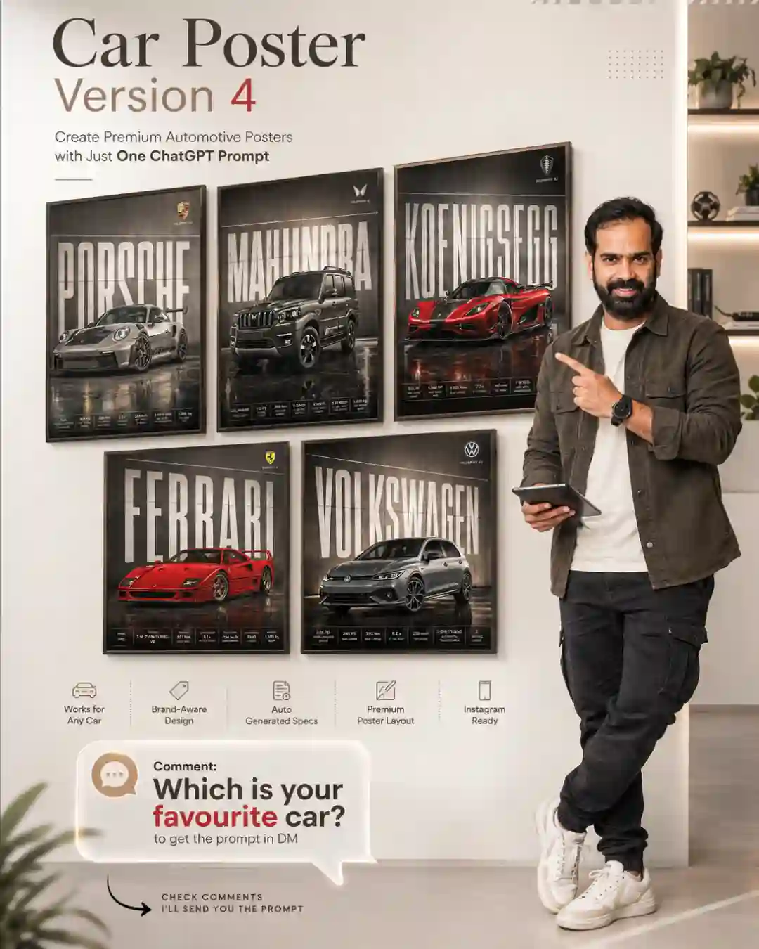
Automotive Poster Ver-4.0
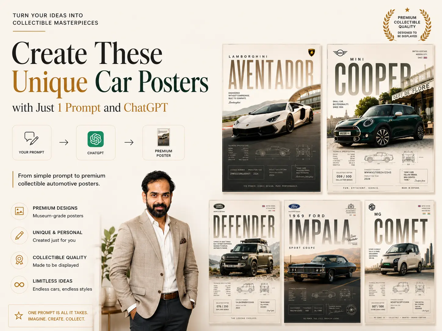
Create a premium bright 4:5 collectible automotive poster for the [CAR NAME].

The design should look like a luxury museum-grade automotive print, combining realistic high-end car photography, editorial magazine layout, collectible motorsport details, and refined minimalist poster design.

The car must be the main hero subject, large in the frame, placed slightly off-center with a dynamic diagonal angle.
Keep the composition spacious, clean, premium, and bright.
Use intentional negative space in the upper area for large typography.

Add massive elegant masthead typography reading “[CAR MODEL]” across the upper background.
The typography should be integrated behind or around the car using subtle transparency, masking, overlap, and depth layering.
It should feel like a luxury automotive magazine cover, not a simple text overlay.

Environment should automatically match the personality of the car:
hypercar in a premium racetrack or futuristic city,
supercar on a sunlit coastal road or luxury mountain pass,
JDM car in a refined neon urban street,
luxury sedan near modern architecture,
vintage classic on a golden cinematic highway,
off-road SUV in bright dusty terrain,
Mini Cooper on retro European café streets,
muscle car on a refined American desert highway,
compact sedan near modern residential architecture or clean city roads.

Add subtle collectible elements:
technical specs, blueprint sketches, chassis number, serial ID, production year, signature mark, collector’s edition number, telemetry micro labels, premium border lines, heritage badges, and small editorial labels.

Lighting must be bright and premium:
soft daylight, golden-hour highlights, realistic glossy reflections, clean shadows, refined contrast, atmospheric depth, matte paper texture, subtle grain, and embossed print feel.

Use an elegant restrained color palette based on the car identity:
cream, beige, muted gold, soft black, graphite, silver, deep red, navy, or heritage green.
Avoid dark-heavy tones and oversaturation.

Final image should feel like a luxury gallery poster, collectible, polished, bright, editorial, and timeless.

Negative:
dark mood, black background, generic wallpaper, dealership ad, centered car, floating car, pasted look, oversaturated colors, excessive effects, cluttered layout, cheap racing graphics, fake HDR, low detail, cartoon look, distorted car, messy text, unreadable typography, wrong logo, harsh shadows, chaotic background.
Bike Edition
Automotive Poster Ver-5.0
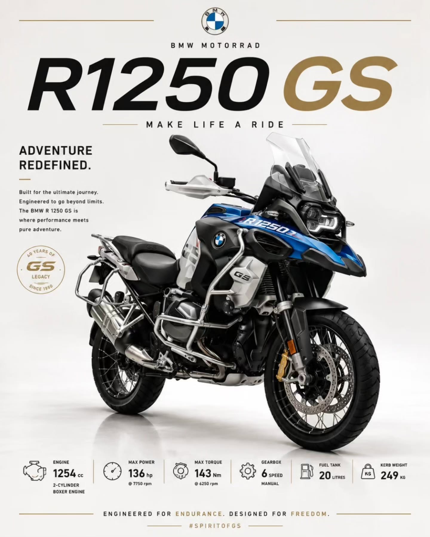
Create a premium bright 4:5 luxury museum-grade bike poster for the [Bike Name]. The bike should be the main hero subject, large in the frame, placed slightly off-center with a clean diagonal angle. Use realistic high-end automotive photography, bright studio lighting, soft shadows, glossy reflections, and a spacious premium white or light beige background.Add refined editorial poster layout elements: elegant title typography, small technical specification text, thin divider lines, subtle collectible badge, and minimal luxury branding details.Keep the composition clean, bright, expensive, modern, and print-worthy.Ultra-realistic, high-detail, premium automotive poster, luxury showroom aesthetic, 4:5 aspect ratio.
Hot Wheel Edition
Automotive Poster Ver-6.0
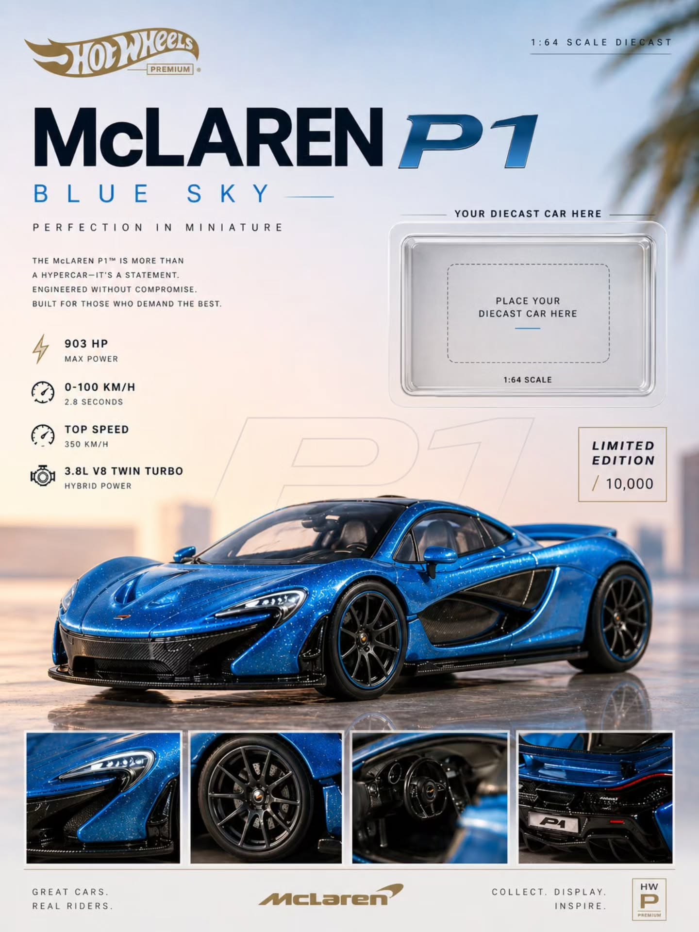
Create a premium aesthetic diecast poster for [CAR MODEL or uploaded image] (1:64). Show the car as the main hero at the bottom in a three-quarter angle, macro style with sharp focus — highlight metallic paint, reflections, panel lines, rubber tires, and fine details. Use a minimal soft gradient background based on the car’s color, with clean lighting and subtle shadows. Add clean typography: Brand + model name (bold) Small “1:64 scale” Minimal specs (optional) Include a small placeholder slot for a real diecast car: Position: top-right or mid-right Style: thin rounded frame / subtle blister tray look Add light shadow for depth Small text: “Place diecast here” Keep layout spacious, balanced, and grid-based. Style: luxury automotive poster, minimal, clean, high-end, frame-worthy.
Most of these prompts are shared on Instagram before they land on this page. Follow 🅾 𝐈𝐧𝐬𝐭𝐚𝐠𝐫𝐚𝐦 @thesaurabhsource for early access.
More Posters Coming Soon
I’m constantly testing new poster styles and adding the best ones here.
Upcoming ideas:
JDM Posters
Racing Posters
Off-Road Posters
Hypercar Posters
Automotive Editorial Posters
Vintage Car Posters
Dealership Advertisement Posters
Motorsport Posters
So if you enjoy creating automotive artwork, bookmark this page and check back from time to time.
Why I Created This Collection
I was tired of seeing generic prompts that produced average-looking results.
Most of the prompts you find online are either too short, too vague, or simply don’t create the premium automotive look many creators are after.
So I started building my own poster systems.
After testing hundreds of generations, refining layouts, adjusting lighting styles, and experimenting with different visual directions, I began saving the best versions.
This page is where I’ll keep sharing them.
Whether you’re creating content for Instagram, building a portfolio, printing wall art, or just having fun with AI, these prompts should give you a strong starting point.
Like These Posters?
These are just the final versions.
On Instagram, I share:
✅ New poster concepts before they’re published here
✅ AI workflows & tricks
✅ Prompt breakdowns
✅ Design resources
✅ Behind-the-scenes experiments
👉 Follow @thesaurabhsource and join thousands of creators exploring AI design and content creation.
Frequently Asked Questions
Which AI tools do these prompts work with?
Most of these prompts can be adapted for ChatGPT Images, Midjourney, Flux, Ideogram, and other modern AI image generators.
Are the prompts free to use?
Yes. Feel free to use them and experiment with your own variations.
Will new poster versions be added?
Absolutely. This page will keep growing as I create new poster styles.
Can I modify the prompts?
Of course. Think of these as a foundation. Change the car, environment, colors, lighting, or typography to match your vision.
Which poster style should I start with?
If you’re new, start with Car Poster V1. It’s the most versatile and works with almost any vehicle.