
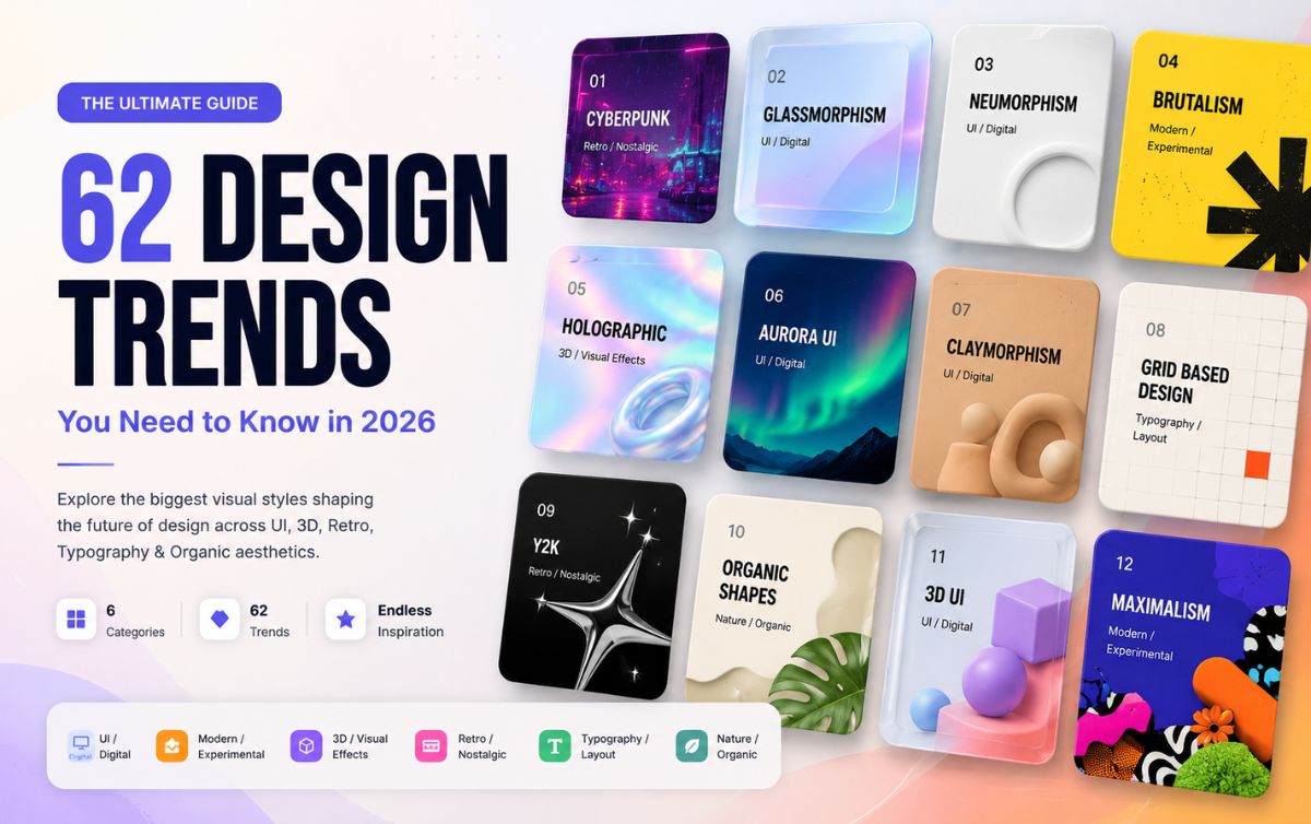

UI design trends 2026 move fast. One month everyone’s obsessed with glassmorphism, next month it’s “liquid glass” and nobody explains the difference.
Here’s the truth: most of these aesthetics overlap more than people admit.
Even Nielsen Norman Group’s State of UX 2026 report agrees – usability is starting to matter more than novelty. So treat this list as a toolkit, not a checklist.
In This Post
Let’s make this simple – one list, grouped properly, with the ones that actually matter explained like a human would.
50+ Design Trends
Explore 62 visual styles across UI, experimental design, 3D, retro aesthetics, typography and organic design.
UI Design Trends 2026 to Watch
Glassmorphism – Frosted glass panels, blur, transparency. Still everywhere in 2026. If your app feels “floaty,” this is why.
Neumorphism – Soft shadows that make elements look pressed into the screen. Looks great in mockups, breaks accessibility in real use. Common mistake: using it for buttons people actually need to read fast.
Claymorphism – Neumorphism’s chunkier, more playful cousin. Rounded, puffy, toy-like. Good for kids’ apps and casual products bad for anything “serious.”
Skeuomorphism – Real-world textures (leather, wood, metal) on digital elements. Old-school Apple. Mostly nostalgia now, occasionally makes a comeback for retro apps.
Flat Design – No shadows, no gradients, just clean shapes. Still the safest default if you don’t want to think too much.
Material Design – Google’s system. Flat design plus purposeful shadows and motion. If you’re building an Android app, you’re basically using this whether you know it or not.
Fluent Design – Microsoft’s version. Similar idea, different personality more depth, more light effects.
Liquid Glass – Apple’s 2025-2026 evolution of glassmorphism. More refractive, more physical. Worth watching if you design for iOS.
Aurora UI – Soft gradient backgrounds that shift like the northern lights. Popular for landing pages that want to feel “premium” without saying it.
Bento UI – Grid layout, boxes of different sizes, like a bento box. Huge right now for dashboards and portfolio sites. Simple rule: if you have mixed content types, this fixes your layout headaches.
Soft UI – Umbrella term, basically neumorphism’s gentler sibling. Rounded corners, muted palettes.
3D UI – Actual depth, not fake shadows. Needs more dev effort but makes products feel expensive.
Holographic UI – Iridescent, shifting colors like a hologram sticker. Great for Gen Z-facing products, exhausting for anything else.
Spatial UI – Designed for AR/VR, think Vision Pro. If you’re not building for headsets yet, file this away for later.
AI-native UI – Interfaces built around chat, prompts, and generative content instead of fixed screens. This is where most new product design is heading worth learning even if you’re not there yet.
Modern & Experimental Aesthetics
Brutalism – Raw, unstyled, almost ugly on purpose. Big black text, harsh grids. Here’s the truth: it works because it looks like nobody tried, and that reads as “authentic” to some audiences.
Neo-Brutalism – Brutalism with color and personality added back in. This is the version most brands actually use now pure brutalism is too harsh for most products.
Maximalism – More of everything. Color, texture, pattern. Bold bet either your brand has the confidence for it or it doesn’t.
Minimalism – Strip everything down to what’s necessary. Still the safest choice if you’re unsure. My recommendation: start minimal, add personality later it’s easier than removing clutter.
Swiss International Style – Grid-based, clean typography, no decoration. The grandparent of modern minimalism.
Editorial Design – Magazine-style layouts big type, generous whitespace, storytelling first. Great for blogs and content-heavy sites.
Organic Modernism – Clean lines but with natural curves and warmth. Minimalism that doesn’t feel cold.
Abstract Geometry – Shapes doing the visual heavy lifting instead of images. Cheap to produce, still looks intentional.
Deconstructed Design – Layouts that look “broken” on purpose overlapping elements, misaligned grids. High risk, high personality.
Anti-Design – Deliberately rejects design rules. Basically brutalism’s rebellious cousin. Not for beginners.
3D & Visual Effects
Isometric Design – Fake 3D at a fixed angle. Popular for explainer illustrations and infographics.
Low-Poly 3D – Simple geometric 3D shapes, faceted look. Fast to render, still looks modern.
Hyperreal 3D – Photorealistic 3D renders. Needs real production budget, but nothing beats it for product visuals.
Chrome / Liquid Metal – Shiny, reflective, metallic surfaces. Been trending hard in 2025-2026, you’ve seen it in a hundred app icons already.
Holographic – Same idea as Holographic UI, but applied to visuals and illustration rather than interface.
Iridescent – Color-shifting surfaces, oil-slick effect. Pairs well with chrome and glass.
Glass 3D – 3D objects rendered like glass. The “liquid glass” trend’s visual sibling.
Paper Cut – Layered paper-style illustration, soft shadows between layers. Warm, tactile, great for storytelling content.
Inflatable 3D – Puffy, balloon-like 3D shapes. Playful, brand-forward, hard to take seriously in B2B.
Toy-like 3D – Cute, rounded, plastic-toy aesthetic. Works if your brand is fun-first.
Retro & Nostalgic Styles
Y2K – Late-90s/early-2000s tech optimism. Chrome text, bubble fonts, gradients. Back in a big way with Gen Z.
Frutiger Aero – Glossy, nature-meets-tech look from mid-2000s (think old Windows Vista). Having a real nostalgia moment right now.
Vaporwave – Pink-purple gradients, glitch art, 80s mall aesthetics. More of a mood than a UI system.
Retro Futurism – How the past imagined the future. Chrome rockets, bold optimism.
Cyberpunk – Neon on dark backgrounds, glitch effects, dystopian tech vibe. If your product touches gaming or crypto, this is probably already your Pinterest board.
Synthwave – Cyberpunk’s music-video cousin sunset gradients, grid horizons, neon.
Memphis – 80s Italian design movement bold shapes, clashing colors, squiggles. Feels “fun and chaotic” on purpose.
Pixel Art – Blocky, retro-game visuals. Instant nostalgia trigger for anyone who grew up gaming.
Arcade Aesthetic – Pixel art’s louder sibling neon, CRT scan lines, coin-op energy.
Retro Editorial – Old print magazine styling brought into digital think 70s typefaces and grain textures.
Typography & Layout Trends
Kinetic Typography – Text that moves. Great for video and motion-heavy landing pages.
Oversized Typography – Massive headlines that dominate the screen. If you don’t want to think too much: bigger text usually means better first impressions.
Experimental Typography – Type that breaks rules overlapping, distorted, unconventional. High risk, needs a confident brand.
Variable Typography – Fonts that adjust weight/width dynamically. More of a technical trend than visual but it’s what makes responsive type actually look good.
Typography-as-Image – Letters shaped to form images or icons. Clever, but easy to overdo.
Grid-Based Design – Everything aligned to a strict grid. The backbone of most “clean” design you’re probably already using this without naming it.
Collage Design – Mixed media, cut-and-paste feel. Popular in editorial and fashion-adjacent brands.
Layered Typography – Overlapping text blocks for depth. Bold move, works best in hero sections.
Type Distortion – Warped, stretched, or glitched letterforms. Mostly for music/gaming brands wanting edge.
Maximal Typography – Loud, oversized, everywhere. Maximalism’s typographic cousin.
Nature & Organic Aesthetics
Biomorphism – Shapes inspired by living organisms curves, blobs, cell-like forms.
Liquid Design – Fluid, flowing shapes. Feels calm and premium when done right.
Organic Shapes – Freeform, non-geometric shapes. Softens an otherwise rigid layout.
Botanical Design – Plant and floral motifs. Popular for wellness, beauty, lifestyle brands.
Earthy Minimalism – Minimalism with warm, natural tones instead of stark white/black.
Natural Texture – Wood grain, linen, stone textures used digitally. Adds warmth fast.
Biophilic Design – Nature-inspired design meant to feel calming more common in physical spaces, growing in digital too.
Which UI Design Trend Should You Actually Use?
If I had to recommend one thing – don’t chase every trend on this list.Simple rule: pick one aesthetic that fits your brand, master it, then borrow one or two accents from another category. Trying to use ten of these at once is how you end up with a homepage that looks like a mood board threw up.
FAQs
What’s the most popular UI design trend in 2026?
Glassmorphism and its newer form, liquid glass, are still dominating UI design right now – especially on iOS and premium web products.
Which design aesthetic is best for beginners?
Flat design or minimalism. Both are forgiving, timeless, and hard to get badly wrong.
Are these design trends useful for AI-generated design work?
Yes – naming a specific aesthetic (like “neo-brutalism” or “bento UI”) in an AI prompt gets far more consistent, intentional results than vague terms like “modern” or “clean.”
How many IJI design trends 2026 should I actually know?
You don’t need all 60+. Pick 5-6 UI design trends 2026 that fit your niche and go deep on those – trying to track every single one is how designers end up copying instead of creating.
Will these Ul design trends 2026 still be relevant next year?
Some will, some won’t. Foundational ones like flat design, minimalism, and grid-based layouts barely move year to year. Flashier ones – Y2K, vaporwave, chrome – cycle in and out faster, so treat those as seasonal accents, not your whole identity.
How do I pick the right UI design trend 2026 for my brand?
Simple rule: match the aesthetic to your audience’s energy, not your personal taste. A fintech app copying cyberpunk UI design trends 2026 confuses people, a gaming brand going full minimalism does the same. Start with what your users expect, then add personality on top.
0 Comments