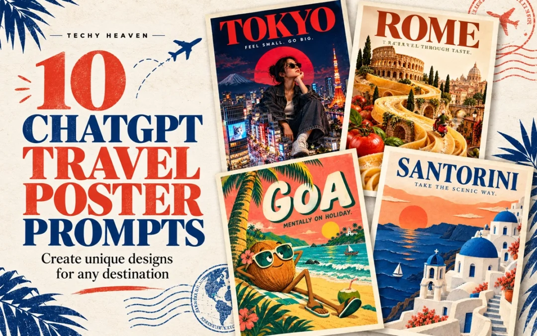
Travel posters do not have to follow the same predictable layout. With the right ChatGPT travel poster prompts, one destination can be transformed into a surreal miniature city, a brutalist collage, a cinematic night scene or even a handcrafted paper world.
Below are ten creative poster directions you can customise for any city, country or landmark.
In This Post
How to Use These Travel Poster Prompts
Replace [PLACE NAME] with your chosen destination and paste the prompt into ChatGPT.
For Instagram posts and digital posters, ask for a vertical 4:5 composition. You can also change the tagline, colours, typography and landmarks.
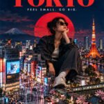
1. Giant Tourist, Tiny City
LOCATION: [PLACE NAME]
Create a surreal travel poster featuring a giant stylish traveller sitting among this destination’s miniature landmarks and streets. Use realistic photographic collage, playful scale, bold editorial typography, and colours inspired by the place. Add the location name and “FEEL SMALL. GO BIG.” Vertical composition, premium finish, no extra text or mockup.
2. Destination Inside Typography
LOCATION: [PLACE NAME]
Create a typography-led travel poster with the location name in massive lettering. Integrate recognisable local landscapes inside the letters, with a few elements breaking beyond their edges. Use a clean background, a refined colour palette, and generous negative space. Make the word clearly readable. Vertical composition, no extra text or mockup.
3. Boarding Pass Poster
LOCATION: [PLACE NAME]
Design a travel poster as an oversized boarding pass with the location name as the main destination. Include subtle perforations, travel stamps, route graphics, and one striking photograph of a local landmark. Use precise ticket-style typography, warm paper texture, and one bold accent colour. Add “DESTINATION: SOMEWHERE NEW.” Vertical layout, minimal supporting details, no mockup.
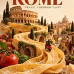
4. Travel Through Taste
LOCATION: [PLACE NAME]
Create a surreal travel poster where a signature local dish transforms into the destination’s landscape, with miniature landmarks integrated into the food. Use appetising realistic textures, an unexpected composition, and a clean studio background. Add elegant bold typography with the location name and “TRAVEL THROUGH TASTE.” Vertical layout, no extra text or mockup.
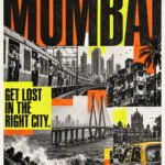
5. Loud City, Loud Poster
LOCATION: [PLACE NAME]
Create a bold brutalist travel poster using authentic local street photography, oversized stretched typography, gritty textures, and sharp overlapping colour blocks. Combine monochrome imagery with one fluorescent accent. Make the location name dominant and add “GET LOST IN THE RIGHT CITY.” Controlled visual chaos, strong readability, vertical layout, no mockup.
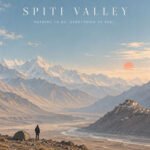
6. The Quietest View
LOCATION: [PLACE NAME]
Create a minimalist travel poster showing one tiny traveller within an expansive, recognisable landscape of this destination. Use soft pastel colours, atmospheric light, subtle grain, and generous negative space. Pair the location name with small elegant typography reading “NOTHING TO DO. EVERYTHING TO FEEL.” Calm, premium vertical composition, no extra elements or mockup.
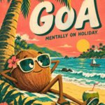
7. Odd Travel Character
LOCATION: [PLACE NAME]
Create a quirky illustrated travel poster starring an eccentric character inspired by this destination’s landscape, food, or landmark. Give it exaggerated proportions, expressive eyes, and unexpected travel accessories. Use playful typography, bold flat colours, and subtle print texture. Include the location name and “MENTALLY ON HOLIDAY.” Vertical layout, distinctive character design, no mockup.
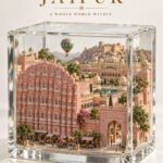
8. Destination in a Glass Box
LOCATION: [PLACE NAME]
Create a travel poster featuring an intricate miniature version of this destination inside a transparent glass cube. Include recognisable landmarks, local terrain, tiny streets, and atmospheric details. Use realistic materials, soft studio lighting, and a clean background. Add the location name with refined museum-label typography and “A WHOLE WORLD WITHIN.” Vertical layout, no mockup.
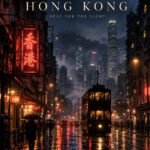
9. After Dark
LOCATION: [PLACE NAME]
Create a cinematic travel poster showing this destination after dark, with authentic local architecture, atmospheric shadows, and luminous reflections. Use deep indigo tones with restrained warm or neon accents. Compose it like an independent film poster, with elegant typography displaying the location name and “STAY FOR THE NIGHT.” Vertical layout, no extra text or mockup.
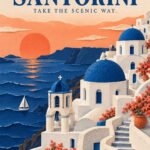
10. Paper World
LOCATION: [PLACE NAME]
Create a handcrafted paper-cut travel poster depicting this destination’s iconic landmarks and landscape through layered coloured paper. Use tactile edges, subtle paper grain, realistic soft shadows, and a limited palette of three complementary colours. Integrate the location name into the composition and add “TAKE THE SCENIC WAY.” Premium vertical layout, no extra text or mockup.
The Six-Part Prompt Formula
When creating your own ChatGPT image prompt, remember this structure:
Mention specific landmarks instead of requesting an entire city.
Limit the design to two or three main colours.
Keep poster text short and clearly specify the exact wording.
Ask for clean margins and a strong typography hierarchy.
Generate a few versions before selecting the final composition.
If the text is incorrect, request a targeted typography correction.
Frequently Asked Questions
Can I use these prompts for any destination?
Yes. Replace the location placeholder and add details associated with your chosen city, country, island or landmark.
What image size should I use?
A vertical 4:5 format works well for Instagram carousel posts. For printing, generate the artwork at the highest available resolution.
Can ChatGPT add text to travel posters?
Yes, but you should provide the exact text inside quotation marks. Always check the final spelling before publishing or printing.
Which travel poster style should I try first?
Start with the destination-inside-typography or minimalist landscape concept. Both work with a wide range of locations and are easy to customise.
These ten ChatGPT travel poster prompts are starting points. Change the destination, visual metaphor, colours and art direction to create a travel-poster collection that feels completely your own.
Start by replacing the location with the destination you want to showcase.
For example:
Bali
Tokyo
Delhi
New York
Santorini
Istanbul
Paris
Dubai
London
Singapore
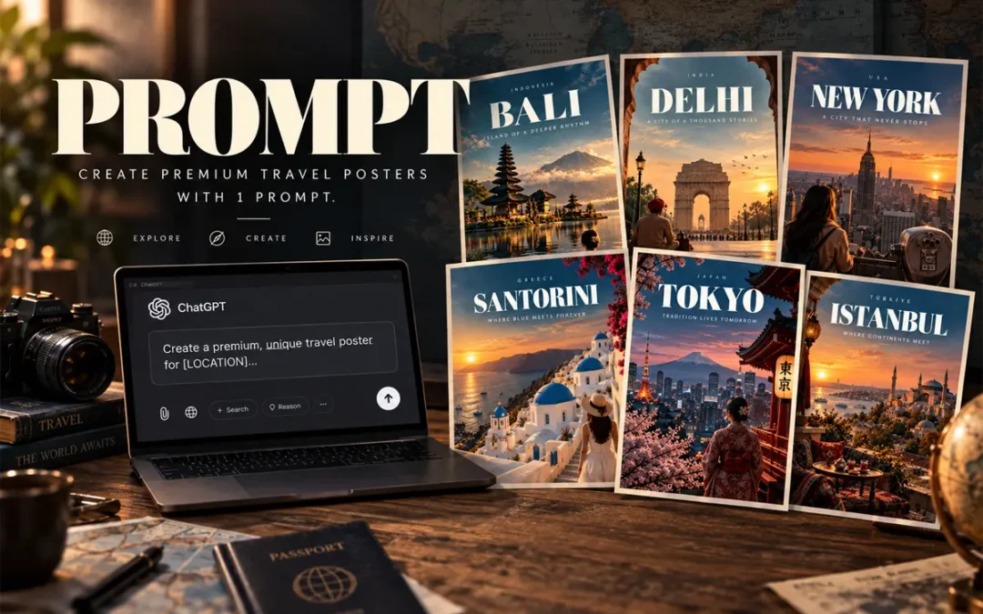
The Complete AI Travel Poster Prompt
Prompt Card
01
AI Image Prompt
Premium Travel Poster
Create image of a premium, unique travel poster for [LOCATION]. Capture its most iconic landscape, architecture, culture, or atmosphere in a cinematic, editorial style. Use bold, sophisticated typography with [LOCATION] as the main title, supported by a short destination-specific tagline. Strong composition, dramatic perspective, refined color palette, realistic details, subtle film grain, luxury travel-magazine aesthetic, print-ready, visually striking, minimal clutter, professional art direction. Avoid generic stock-photo styling and excessive text. –ar 4:5
You can now combine everything into one reusable template:
Create image of a premium, unique travel poster for [LOCATION]. Capture its most iconic landscape, architecture, culture, or atmosphere in a cinematic, editorial style. Use bold, sophisticated typography with [LOCATION] as the main title, supported by a short destination-specific tagline. Strong composition, dramatic perspective, refined color palette, realistic details, subtle film grain, luxury travel-magazine aesthetic, print-ready, visually striking, minimal clutter, professional art direction. Avoid generic stock-photo styling and excessive text. –ar 4:5
Simply replace [LOCATION] with your destination.
Quick Formula to Remember
If you want to create your own prompts quickly, remember:
Open ChatGPT + Paste Prompt + Replace Location placeholder with your Destination + Submit
That’s enough to build a strong starting point.
The result should look less like an AI-generated image and more like a luxury travel magazine cover.
Frequently Asked Questions
What is the best AI travel poster prompt?
The best AI travel poster prompt combines a specific destination, recognizable visual story, cinematic photography direction, typography hierarchy, composition, color palette and finishing details.
Can I use this prompt for any destination?
Yes. Replace the location and adapt the visual story to the destination. The same framework works for cities, countries, islands and tourist destinations.
What aspect ratio should I use for travel posters?
A 4:5 vertical format works particularly well for social media posts, carousel designs and digital travel campaigns.
How do I make an AI travel poster look more realistic?
Use specific environmental details, natural lighting, realistic textures, atmospheric depth, photographic composition and subtle film grain. Avoid stuffing the prompt with too many landmarks.
How much text should a travel poster contain?
Keep it minimal. A strong hierarchy usually needs only the country, destination name and a short tagline, with optional small supporting text.
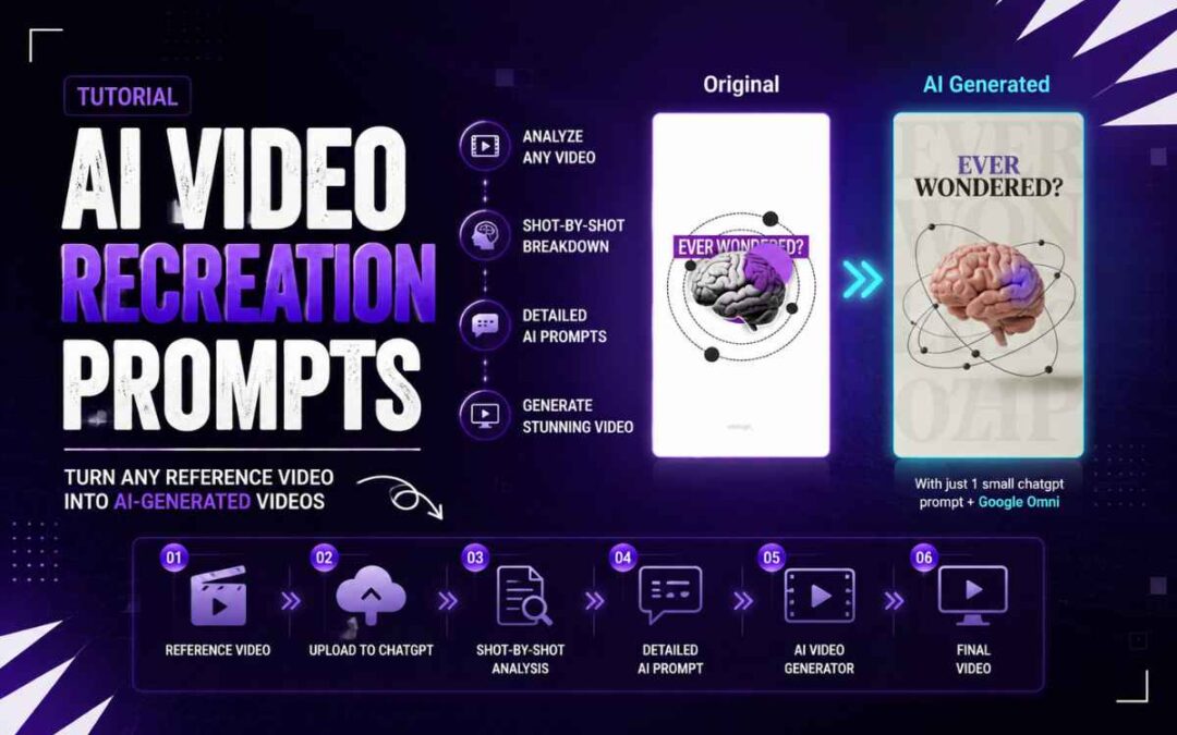
Find a video you like on Pinterest or any other reference source.
Choose a video with clear:
Camera movement
Subject action
Lighting
Composition
Visual style
02. Upload to ChatGPT
Upload the reference video to ChatGPT.
01
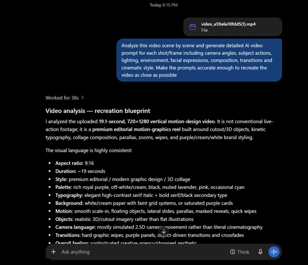
CHATGPT PROMPT
Video Analysis
PROMPT_01
Analyze this video scene by scene and generate detailed AI video prompts for each shot/frame including camera angles, subject actions, lighting, environment, facial expressions, composition, transitions and cinematic style. Make the prompts accurate enough to recreate the video as close as possible.
REFERENCE VIDEO
SHOT-BY-SHOT ANALYSIS
If above “copy prompt” button didn’t work then below in simple text:
Analyze this video scene by scene and generate detailed AI video prompts for each shot/frame including camera angles, subject actions, lighting, environment, facial expressions, composition, transitions and cinematic style. Make the prompts accurate enough to recreate the video as close as possible.
03. Get the AI Prompts
ChatGPT will analyze the video and break it down into individual shots.
Each prompt should describe:
Camera angle
Camera movement
Subject action
Lighting
Environment
Facial expression
Composition
Transitions
Cinematic style
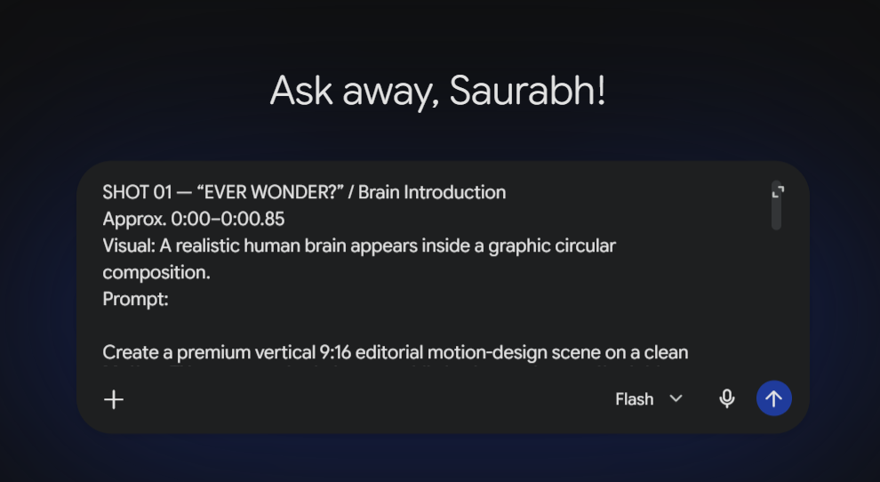
04. Copy the Prompt
Copy the generated prompt for the shot you want to create.
Don’t shorten it too much.
The more useful visual details you keep, the more control you have over the output.
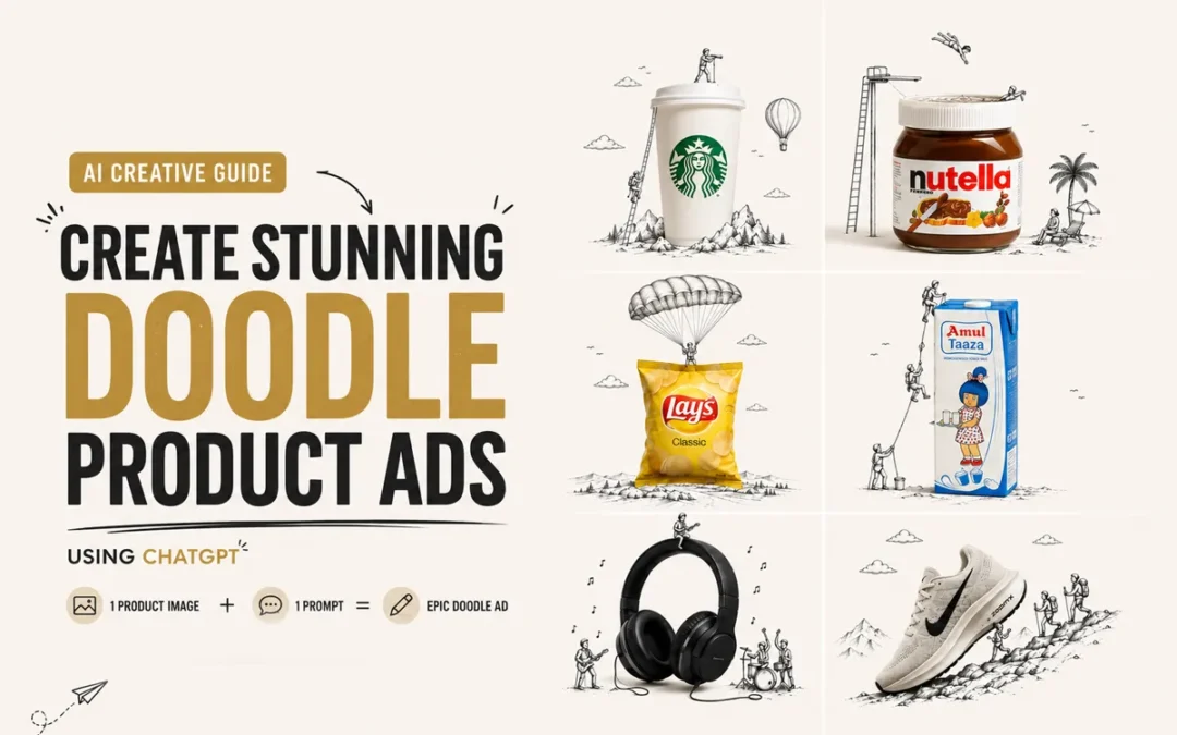
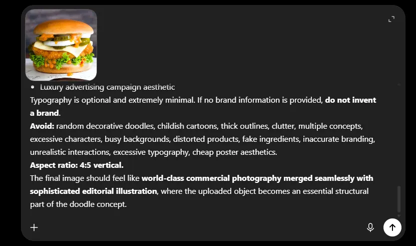
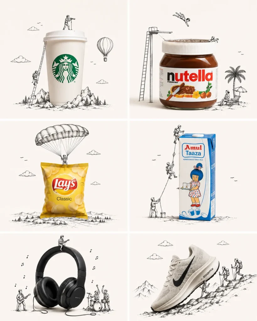
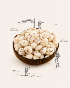
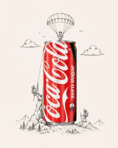
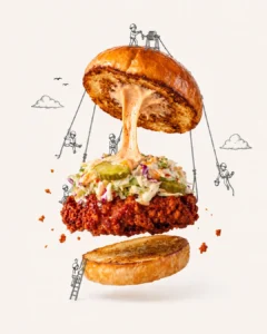
Want to turn a simple product photo into a creative advertising visual like this? You can create the entire concept using one product image + one master prompt in ChatGPT.
You can experiment with almost anything—food, beverages, shoes, headphones, cosmetics, packaging, gadgets, etc.
Step 3: Add the Master Prompt
Paste the doodle creative prompt along with your uploaded image.
Create Doodle Product Ads
Use the uploaded product or food image as the exact hero reference.

Create an ultra-premium minimalist 4:5 advertising poster combining the real, hyper-realistic uploaded object with an elegant black-and-white hand-drawn doodle illustration.

Creative Concept

First analyze the uploaded object’s shape, silhouette, orientation, function, texture, and distinctive features. Then invent ONE clever visual metaphor specifically inspired by it.

Imagine: “What could this object become inside a tiny illustrated world?”

It could naturally function as a parachute, vehicle, mountain, boat, building, flying machine, playground, landscape, tool, planet, bridge, etc.—but do not force these examples. Create an original idea that best fits the specific object.

Most Important Rule

The doodle must physically interact with the real object, not simply decorate the space around it.

Tiny hand-drawn characters may climb, ride, hang from, fly with, build on, push, pull, sail, explore, or otherwise use the object.

REAL OBJECT + DOODLE = ONE COMPLETE VISUAL IDEA.

Make the interaction clever, instantly understandable, physically believable, witty, and sophisticated.

Product Accuracy

Keep the uploaded object photorealistic and recognizable. Preserve its original shape, proportions, colors, materials, textures, branding, packaging, and important details.

For food, preserve authentic texture and ingredients while making it extremely fresh and appetizing.

Visual Style

Hyper-realistic premium product/food photography
Thin, refined black-ink hand-drawn illustration
Tiny elegant illustrated characters
Warm white / pale neutral background
Generous negative space
Soft premium studio lighting
Subtle realistic shadows
Minimal editorial composition
One hero object
One strong doodle concept
Intelligent, poetic humor
Luxury advertising campaign aesthetic

Typography is optional and extremely minimal. If no brand information is provided, do not invent a brand.

Avoid: random decorative doodles, childish cartoons, thick outlines, clutter, multiple concepts, excessive characters, busy backgrounds, distorted products, fake ingredients, inaccurate branding, unrealistic interactions, excessive typography, cheap poster aesthetics.

Aspect ratio: 4:5 vertical.

The final image should feel like world-class commercial photography merged seamlessly with sophisticated editorial illustration, where the uploaded object becomes an essential structural part of the doodle concept.
If above “copy prompt” button not working then here is plain prompt text below
Use the uploaded product or food image as the exact hero reference.

Create an ultra-premium minimalist 4:5 advertising poster combining the real, hyper-realistic uploaded object with an elegant black-and-white hand-drawn doodle illustration.

Creative Concept

First analyze the uploaded object’s shape, silhouette, orientation, function, texture, and distinctive features. Then invent ONE clever visual metaphor specifically inspired by it.

Imagine: “What could this object become inside a tiny illustrated world?”

It could naturally function as a parachute, vehicle, mountain, boat, building, flying machine, playground, landscape, tool, planet, bridge, etc.—but do not force these examples. Create an original idea that best fits the specific object.

Most Important Rule

The doodle must physically interact with the real object, not simply decorate the space around it.

Tiny hand-drawn characters may climb, ride, hang from, fly with, build on, push, pull, sail, explore, or otherwise use the object.

REAL OBJECT + DOODLE = ONE COMPLETE VISUAL IDEA.

Make the interaction clever, instantly understandable, physically believable, witty, and sophisticated.

Product Accuracy

Keep the uploaded object photorealistic and recognizable. Preserve its original shape, proportions, colors, materials, textures, branding, packaging, and important details.

For food, preserve authentic texture and ingredients while making it extremely fresh and appetizing.

Visual Style

Hyper-realistic premium product/food photography
Thin, refined black-ink hand-drawn illustration
Tiny elegant illustrated characters
Warm white / pale neutral background
Generous negative space
Soft premium studio lighting
Subtle realistic shadows
Minimal editorial composition
One hero object
One strong doodle concept
Intelligent, poetic humor
Luxury advertising campaign aesthetic

Typography is optional and extremely minimal. If no brand information is provided, do not invent a brand.

Avoid: random decorative doodles, childish cartoons, thick outlines, clutter, multiple concepts, excessive characters, busy backgrounds, distorted products, fake ingredients, inaccurate branding, unrealistic interactions, excessive typography, cheap poster aesthetics.

Aspect ratio: 4:5 vertical.

The final image should feel like world-class commercial photography merged seamlessly with sophisticated editorial illustration, where the uploaded object becomes an essential structural part of the doodle concept.
The prompt tells ChatGPT to:
Keep the real product photorealistic
Analyze its shape and structure
Invent a visual metaphor around it
Add tiny hand-drawn characters
Make the doodles physically interact with the product
Create a premium minimalist advertising composition
For example, a shoe might become a mountain for hikers, a jar could become a swimming pool, or a product pack could become part of a tiny adventure world.
Step 4: Generate Your Creative
Ask for a 4:5 vertical poster if you’re creating content for Instagram.
The key idea is:
REAL PRODUCT + DOODLE WORLD = ONE VISUAL STORY
Avoid doodles that are simply floating around the product. The illustration should actually climb, use, ride, build on, hang from, or interact with the product.
Step 5: Experiment
Don’t stop at the first generation. Upload different products using the same master prompt.
You can also ask ChatGPT:
“Create another concept, but use a completely different visual metaphor and keep the product unchanged.”
This makes it easy to turn one technique into an entire creative series.
Get More AI Creative Prompts
Want more AI prompts for product ads, posters, photography, and creative visuals?
Follow @thesaurabhsource on Instagram for new prompts, creative ideas, and AI experiments.
FAQs
What are AI Doodle Product Ads?
AI Doodle Product Ads combine a realistic product photo with hand-drawn illustrations to turn the product into part of a creative visual story.
How can I create doodle product ads with ChatGPT?
Upload your product image to ChatGPT, paste the master doodle prompt, and ask it to create a 4:5 advertising creative.
Do I need design or prompting skills?
No. A clear product image and the master prompt are enough to get started. You can refine the generated concept with simple follow-up instructions.
What products can I use?
You can experiment with food, beverages, shoes, gadgets, cosmetics, packaging, fashion products, accessories, and more.
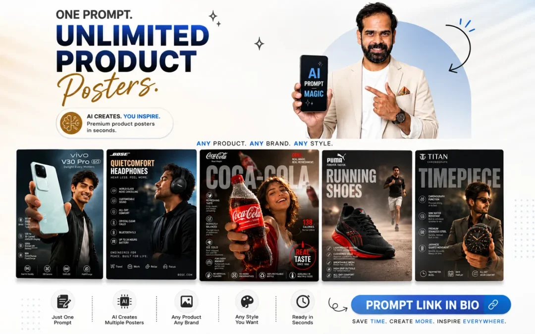
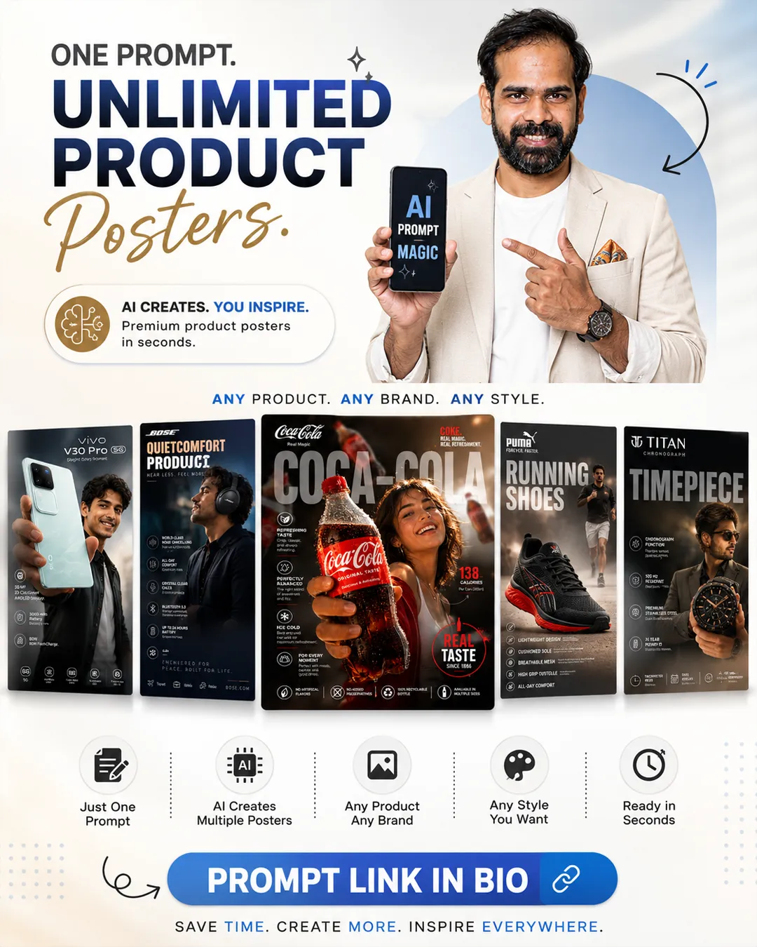
Creating high-end commercial product advertisements no longer requires advanced design skills. With this universal prompt, you can generate premium product posters for smartphones, headphones, shoes, watches, beverages, cosmetics, gadgets, and more using just a product image or product name.
Product Poster
[Product Name]
Create a premium image, high-impact commercial infographic advertisement for [Product Name] in a modern editorial e-commerce style. Make the product the unmistakable hero of the composition, occupying 45–60% of the frame. Present it naturally according to its category (held, worn, displayed, installed, or in use), with cinematic perspective and shallow depth of field that keeps the product razor-sharp while softly blurring the surroundings. Include a professional lifestyle model that naturally matches the product's category, target audience, and branding. The model should interact with the product realistically and feel confident, approachable, and authentic. Adapt the model's age, clothing, styling, expression, and environment automatically to suit the product. Generate a premium background appropriate for the product category (studio, office, home, gym, luxury interior, automotive, outdoor, café, gaming setup, etc.). Add subtle floating versions of the same product, soft bokeh, light leaks, lens flares, reflections, and atmospheric depth to create a polished advertising look without distracting from the main product. Use a clean editorial layout with oversized semi-transparent background typography displaying the product category. Place [PRODUCT_NAME] prominently at the top with a short premium tagline. Automatically generate 4–6 relevant feature callouts with elegant icons based on the product category. Include only specifications that make sense for the product—never display irrelevant features. Use a premium color palette inspired by the product and its branding for perfect visual harmony. Maintain balanced spacing, refined typography, and a clean luxury aesthetic. Photography Style: Commercial product photography, 85mm macro lens, slight low-angle perspective, soft three-point studio lighting, ultra-shallow depth of field, premium reflections, hyper-realistic materials, crisp details, natural color grading. Design Style: Apple keynote quality, Nike campaign aesthetics, Samsung launch presentation, modern luxury editorial, premium e-commerce advertisement, minimal yet impactful, magazine-quality composition. Output Quality: Ultra-realistic, photorealistic, 8K, HDR, sharp focus, professional advertising, clean graphic design, visually striking, premium commercial artwork. in 4:5
In This Post
Step-by-Step Guide
Step 1 — Copy the Prompt
Copy the complete Universal AI Product Poster Prompt provided below.
Create a premium image, high-impact commercial infographic advertisement for [Product Name] in a modern editorial e-commerce style. Make the product the unmistakable hero of the composition, occupying 45–60% of the frame. Present it naturally according to its category (held, worn, displayed, installed, or in use), with cinematic perspective and shallow depth of field that keeps the product razor-sharp while softly blurring the surroundings. Include a professional lifestyle model that naturally matches the product’s category, target audience, and branding. The model should interact with the product realistically and feel confident, approachable, and authentic. Adapt the model’s age, clothing, styling, expression, and environment automatically to suit the product. Generate a premium background appropriate for the product category (studio, office, home, gym, luxury interior, automotive, outdoor, café, gaming setup, etc.). Add subtle floating versions of the same product, soft bokeh, light leaks, lens flares, reflections, and atmospheric depth to create a polished advertising look without distracting from the main product. Use a clean editorial layout with oversized semi-transparent background typography displaying the product category. Place [PRODUCT_NAME] prominently at the top with a short premium tagline. Automatically generate 4–6 relevant feature callouts with elegant icons based on the product category. Include only specifications that make sense for the product—never display irrelevant features. Use a premium color palette inspired by the product and its branding for perfect visual harmony. Maintain balanced spacing, refined typography, and a clean luxury aesthetic. Photography Style: Commercial product photography, 85mm macro lens, slight low-angle perspective, soft three-point studio lighting, ultra-shallow depth of field, premium reflections, hyper-realistic materials, crisp details, natural color grading. Design Style: Apple keynote quality, Nike campaign aesthetics, Samsung launch presentation, modern luxury editorial, premium e-commerce advertisement, minimal yet impactful, magazine-quality composition. Output Quality: Ultra-realistic, photorealistic, 8K, HDR, sharp focus, professional advertising, clean graphic design, visually striking, premium commercial artwork. in 4:5
Open ChatGPT with image generation enabled and paste the prompt into the chat.
Step 4 — Generate the Poster
Click Generate. ChatGPT will create a premium commercial product advertisement with:
Hero product shot
Lifestyle model
Editorial typography
Feature callouts
Brand-inspired colors
Premium lighting
Professional marketing layout
Step 5 — Customize
Regenerate the image or modify the prompt to create different styles, backgrounds, models, or layouts for the same product.
Why This Prompt Works
Works with any product category
Supports both product image and product name
Automatically chooses relevant icons and features
Generates premium commercial advertising layouts
Perfect for social media, eCommerce, Amazon, Shopify, and marketing campaigns
Best Use Cases
Smartphones
Laptops
Headphones
Watches
Shoes
Perfumes
Cosmetics
Food & Beverage
Fitness Products
Home Appliances
Automotive Accessories
Fashion Products
Conclusion
If you’re looking for a single prompt that can generate premium product advertisements for almost any brand or product, this Universal AI Product Poster Prompt is an excellent starting point. Simply provide a product image or name, and let AI create professional marketing creatives in seconds.
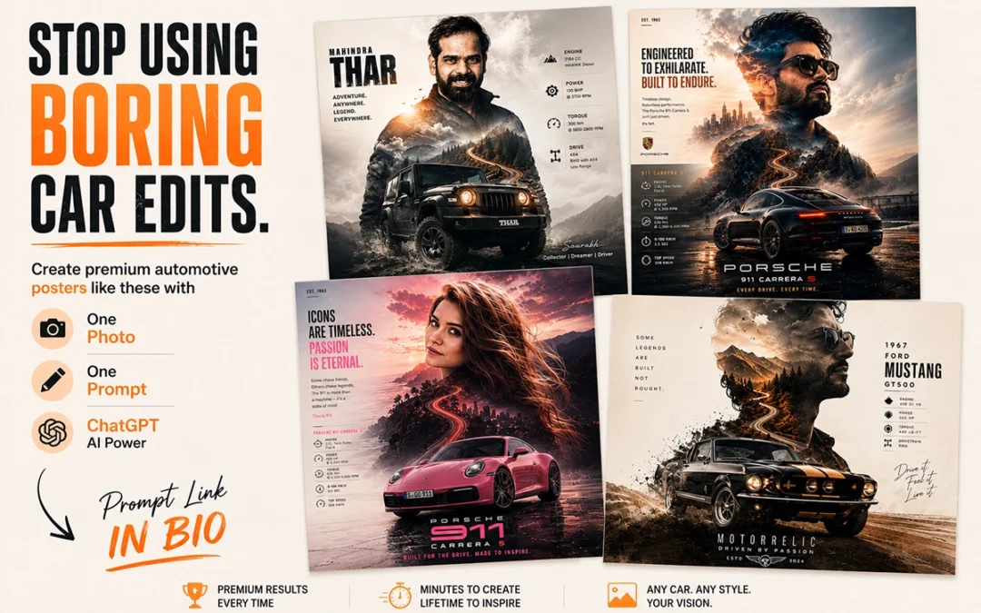
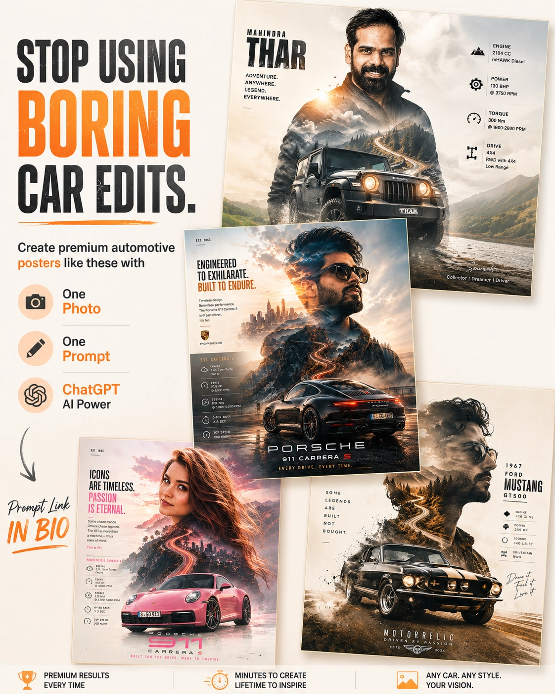
Want to transform a simple portrait into a premium automotive collector poster?
With this master prompt, you only need one photo, one prompt, and ChatGPT to generate stunning double-exposure automotive artwork inspired by your favorite car.
Follow these simple steps.
In This Post
Automotive Poster Ver-7.0
[CAR NAME]

Use the uploaded portrait only as a facial reference, not as an exact photo recreation. Create a stylized, editorial portrait inspired by the person's facial features, hairstyle, beard, and overall appearance while maintaining a recognizable resemblance. The face should look like a premium automotive campaign model rather than a copied photograph.

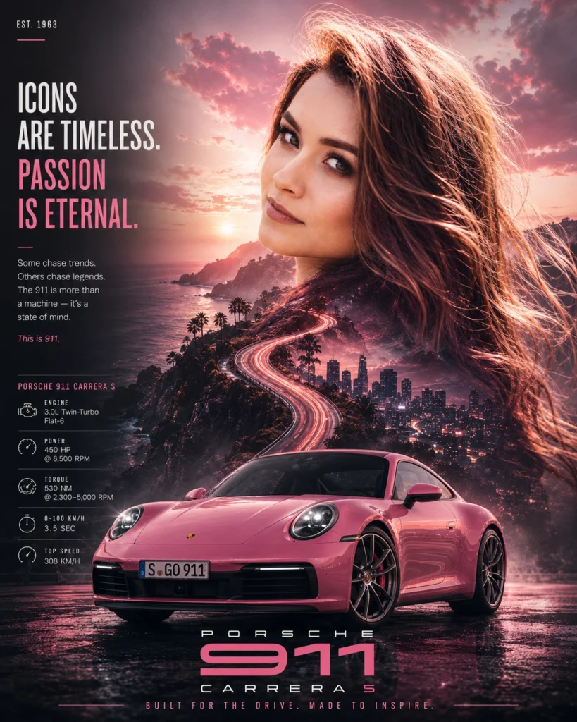
Design a cinematic double-exposure automotive collector poster featuring a [CAR NAME]. Automatically choose the environment, color palette, lighting, textures, and atmosphere based on the personality and heritage of the selected car (muscle, JDM, supercar, luxury, off-road, hypercar, etc.).

Blend scenic roads, landscapes, clouds, mountains, city lights, motion trails, smoke, and cinematic textures naturally within the portrait silhouette. Place the [CAR NAME] in a photorealistic 3/4 hero angle at the bottom with authentic details, premium reflections, and dramatic automotive lighting.

Use a clean luxury editorial layout with elegant typography, a minimal specification panel, subtle film grain, and balanced negative space. The final artwork should resemble a high-end automotive magazine cover or collector poster, where the portrait is artistically reinterpreted, not an exact reproduction of the uploaded image.

Style: Double exposure, editorial, luxury automotive advertising, cinematic, ultra-photorealistic, HDR, premium color grading, realistic reflections, 8K quality.
Step 1: Upload Your Portrait
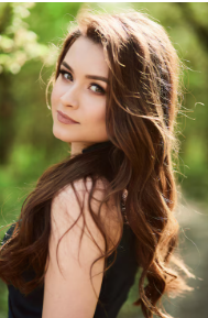
Choose a clear front-facing or slightly angled portrait with good lighting.
The AI uses your photo only as a facial reference to create a stylized editorial portrait—not an exact photo recreation.
Step 2: Pick Your Dream Car
Replace [CAR NAME] in the prompt with any vehicle you like.
Examples:
Porsche 911 GT3 RS
Nissan Skyline GT-R R34
Mahindra Thar
Ford Mustang GT500
BMW M4 Competition
Toyota Supra MK4
Lamborghini Huracán
Ferrari 488 Pista
The AI automatically adapts the environment, colors, lighting, and atmosphere based on the selected vehicle.
Step 3: Copy the Master Prompt
Copy the complete Automotive Poster Prompt from this page.
[CAR NAME]

Use the uploaded portrait only as a facial reference, not as an exact photo recreation. Create a stylized, editorial portrait inspired by the person's facial features, hairstyle, beard, and overall appearance while maintaining a recognizable resemblance. The face should look like a premium automotive campaign model rather than a copied photograph.

Design a cinematic double-exposure automotive collector poster featuring a [CAR NAME]. Automatically choose the environment, color palette, lighting, textures, and atmosphere based on the personality and heritage of the selected car (muscle, JDM, supercar, luxury, off-road, hypercar, etc.).

Blend scenic roads, landscapes, clouds, mountains, city lights, motion trails, smoke, and cinematic textures naturally within the portrait silhouette. Place the [CAR NAME] in a photorealistic 3/4 hero angle at the bottom with authentic details, premium reflections, and dramatic automotive lighting.

Use a clean luxury editorial layout with elegant typography, a minimal specification panel, subtle film grain, and balanced negative space. The final artwork should resemble a high-end automotive magazine cover or collector poster, where the portrait is artistically reinterpreted, not an exact reproduction of the uploaded image.

Style: Double exposure, editorial, luxury automotive advertising, cinematic, ultra-photorealistic, HDR, premium color grading, realistic reflections, 8K quality.
No editing is required—simply replace [CAR NAME] with your preferred vehicle.
Step 4: Paste into ChatGPT
Upload your portrait and paste the prompt into ChatGPT.
Within seconds, ChatGPT generates a premium double-exposure automotive collector poster with a magazine-quality layout.
Step 5: Download & Share
Your final artwork is ready for:
Instagram Posts
Wallpapers
Portfolio Showcase
Print Posters
Gifts
Automotive Collectibles
Tips for Better Results
Use a high-resolution portrait.
Avoid cluttered backgrounds.
Choose cars that match your personality.
Use bright, well-lit photos.
Experiment with different car models for unique themes.
Final Result
With just one photo, one prompt, and ChatGPT, you can create cinematic automotive posters that look like premium magazine covers—without any Photoshop or advanced design skills.
Whether you’re a car enthusiast, content creator, or designer, this prompt makes it easy to turn your dream car into a personalized collector poster.