
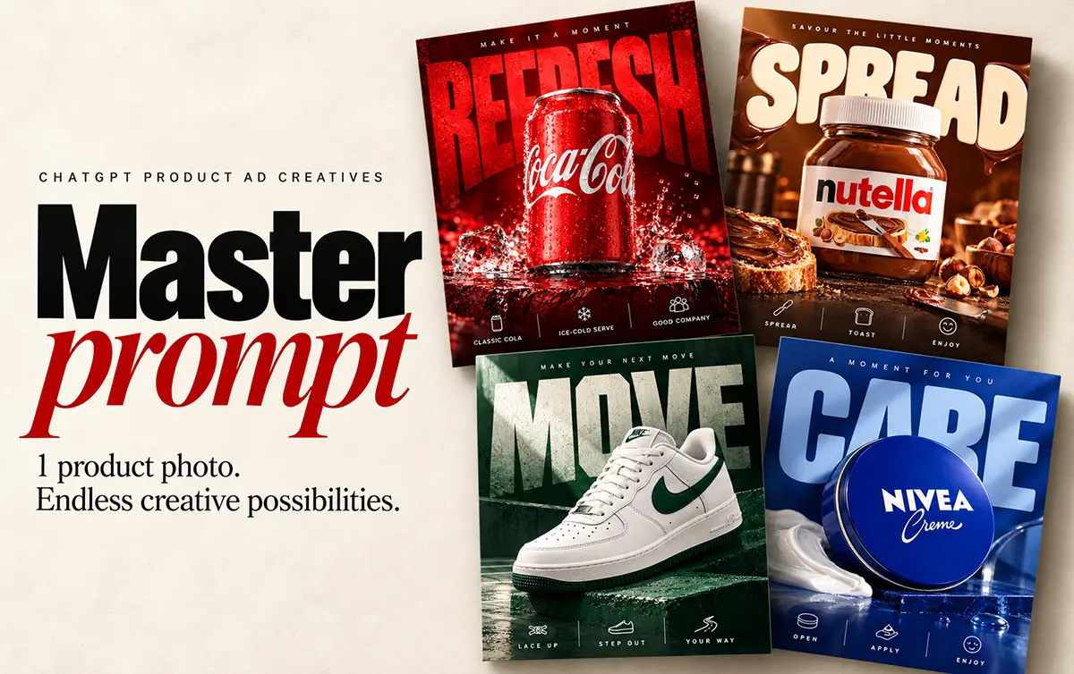

You have a product photo. Now you want to turn it into an ad that makes someone stop scrolling.
That’s where ChatGPT product ad creatives can help. Upload your photo, give it a clear design brief, and use the result as a starting point.
But here’s something I noticed: asking for a “premium ad” often gives you a nice product picture with a headline above it. If you want something closer to the examples here, you need to explain the layout too.
How to Make ChatGPT Product Ad Creatives
Master Prompt
Automotive Poster Ver-1.0
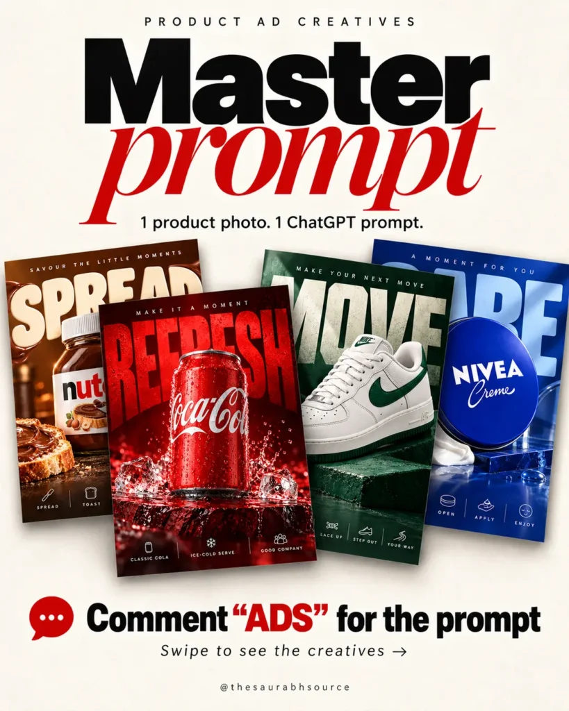
Create ONE finished premium product advertising poster from the uploaded product photo in portrait 4:5 format (1080 × 1350 px if supported). Generate the actual image, not a written concept.

TARGET STYLE
Create a richly art-directed studio campaign poster like the attached KitKat, protein oats and body-wash references: saturated packaging-led colour, monumental typography BEHIND the product, a large overlapping product hero, a tactile foreground and compact editorial details. This specific visual structure is required. Avoid a generic product photograph with a separate headline above it.

INPUT ROLES
The product photo defines the exact product identity. The reference posters define the composition and visual treatment. Ignore all Instagram UI, usernames, engagement counts and mockup surroundings in screenshots. Do not copy the reference brand, product, claims or headline onto a different product.

COMPOSITION — BUILD ONE INTEGRATED SCENE
• Fill the canvas with a rich dominant hue sampled from the packaging, using deeper shadows and controlled lighter accents. For a white or neutral product, use its visible accent colour or a contrasting studio backdrop. Do not default to beige walls, leafy window shadows or a generic outdoor lifestyle scene.
• Place one enormous 1–3-word headline across the upper background, occupying roughly the top 35–45% and spanning almost the full width. It may extend behind the hero into the middle of the poster. The product must overlap part of the lettering. Preserve enough visible letterforms to understand the word.
• Make the product the dominant middle-to-lower foreground subject, with a silhouette spanning roughly 55–70% of the canvas height where its proportions allow. Fit wide products naturally without stretching. Keep important branding readable. Choose an upright, slight three-quarter or subtly tilted presentation only when supported by the upload.
• Ground the product on a suitable tactile studio surface or low platform. Use foreground, hero and background layers for depth, with convincing contact shadows.
• Add a small, deliberate arrangement of category-relevant elements around the base and lower corners. Food: confirmed ingredients, crumbs or a serving detail. Drinks: ice, condensation or water where appropriate. Footwear or technology: suitable material surfaces and product details, not food props. Leave the main label unobstructed.
• Add one small, widely spaced introductory line near the top. Use up to three short side callouts and, when suitable verified information exists, a slim translucent bottom strip with simple line icons. Distribute facts across these areas without duplication. Omit unsupported callouts rather than inventing them.

TYPOGRAPHY
Use strong display lettering with deliberate kerning and substantial visual presence. Choose the letterform for the product: bold condensed sans, broad athletic type, rounded playful lettering or another equally strong category-appropriate display face. Keep the required oversized-background-type structure while adapting the typeface. Use tonal contrast so the background headline supports rather than overwhelms the product. Avoid decorative swooshes, unnecessary script and a small isolated headline floating above the photograph.

PRODUCT ACCURACY AND COPY
Preserve the supplied product's logo, shape, proportions, label artwork, colours, cap, materials and visible details. Use the original product image where possible; never redesign packaging, invent an unseen side or add an unprovided variant. Write an original short headline appropriate to the product. Use only readable packaging facts or user-provided details for claims. Never invent percentages, ingredients, certifications, health benefits, offers or performance promises. No CTA unless requested.

PHOTOGRAPHIC FINISH
Use controlled commercial studio lighting, realistic material response, crisp packaging detail, selective reflections, coherent shadows and natural texture. Aim for the visual richness of the references with disciplined spacing: richly composed, readable and product-focused. Avoid excessive bloom, glossy plastic-looking surfaces, random floating objects and gratuitous splashes.

FINAL CHECK
Check that the headline is actually behind and overlapped by the product, the palette comes from the new product, the scene has tangible depth, and product identity and all added copy remain faithful. If the composition is merely “headline on top + ordinary product photo below,” redesign it before returning.

Return only the final edge-to-edge poster: no collage, mockup border, watermark, social interface or explanatory text.
If above “COPY PROMPT” Button didn’t work, here is the prompt below:
Create ONE finished premium product advertising poster from the uploaded product photo in portrait 4:5 format (1080 × 1350 px if supported). Generate the actual image, not a written concept.

TARGET STYLE
Create a richly art-directed studio campaign poster like the attached KitKat, protein oats and body-wash references: saturated packaging-led colour, monumental typography BEHIND the product, a large overlapping product hero, a tactile foreground and compact editorial details. This specific visual structure is required. Avoid a generic product photograph with a separate headline above it.

INPUT ROLES
The product photo defines the exact product identity. The reference posters define the composition and visual treatment. Ignore all Instagram UI, usernames, engagement counts and mockup surroundings in screenshots. Do not copy the reference brand, product, claims or headline onto a different product.

COMPOSITION — BUILD ONE INTEGRATED SCENE
• Fill the canvas with a rich dominant hue sampled from the packaging, using deeper shadows and controlled lighter accents. For a white or neutral product, use its visible accent colour or a contrasting studio backdrop. Do not default to beige walls, leafy window shadows or a generic outdoor lifestyle scene.
• Place one enormous 1–3-word headline across the upper background, occupying roughly the top 35–45% and spanning almost the full width. It may extend behind the hero into the middle of the poster. The product must overlap part of the lettering. Preserve enough visible letterforms to understand the word.
• Make the product the dominant middle-to-lower foreground subject, with a silhouette spanning roughly 55–70% of the canvas height where its proportions allow. Fit wide products naturally without stretching. Keep important branding readable. Choose an upright, slight three-quarter or subtly tilted presentation only when supported by the upload.
• Ground the product on a suitable tactile studio surface or low platform. Use foreground, hero and background layers for depth, with convincing contact shadows.
• Add a small, deliberate arrangement of category-relevant elements around the base and lower corners. Food: confirmed ingredients, crumbs or a serving detail. Drinks: ice, condensation or water where appropriate. Footwear or technology: suitable material surfaces and product details, not food props. Leave the main label unobstructed.
• Add one small, widely spaced introductory line near the top. Use up to three short side callouts and, when suitable verified information exists, a slim translucent bottom strip with simple line icons. Distribute facts across these areas without duplication. Omit unsupported callouts rather than inventing them.

TYPOGRAPHY
Use strong display lettering with deliberate kerning and substantial visual presence. Choose the letterform for the product: bold condensed sans, broad athletic type, rounded playful lettering or another equally strong category-appropriate display face. Keep the required oversized-background-type structure while adapting the typeface. Use tonal contrast so the background headline supports rather than overwhelms the product. Avoid decorative swooshes, unnecessary script and a small isolated headline floating above the photograph.

PRODUCT ACCURACY AND COPY
Preserve the supplied product's logo, shape, proportions, label artwork, colours, cap, materials and visible details. Use the original product image where possible; never redesign packaging, invent an unseen side or add an unprovided variant. Write an original short headline appropriate to the product. Use only readable packaging facts or user-provided details for claims. Never invent percentages, ingredients, certifications, health benefits, offers or performance promises. No CTA unless requested.

PHOTOGRAPHIC FINISH
Use controlled commercial studio lighting, realistic material response, crisp packaging detail, selective reflections, coherent shadows and natural texture. Aim for the visual richness of the references with disciplined spacing: richly composed, readable and product-focused. Avoid excessive bloom, glossy plastic-looking surfaces, random floating objects and gratuitous splashes.

FINAL CHECK
Check that the headline is actually behind and overlapped by the product, the palette comes from the new product, the scene has tangible depth, and product identity and all added copy remain faithful. If the composition is merely “headline on top + ordinary product photo below,” redesign it before returning.

Return only the final edge-to-edge poster: no collage, mockup border, watermark, social interface or explanatory text.
1. Start with a clear product photo
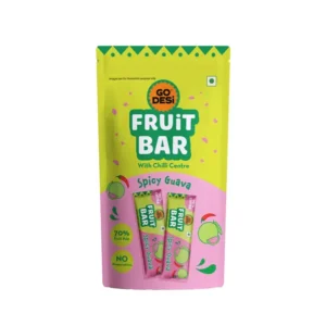
Choose a photo where the logo, packaging and main details are easy to see. Avoid blurry images or photos where part of the product is hidden.
The clearer the input, the easier it is to check whether the result matches your product.
2. Paste the master prompt (Given Above)
The prompt explains how the design should come together: a large product, oversized lettering behind it, colours taken from the packaging, and props that fit the product.
For example, a chocolate ad might use broken chocolate pieces. A sneaker ad might use a textured platform.
You don’t need every possible effect. A few well-chosen details usually make more sense.
3. Ask for one useful change
If the first result feels basic, say exactly what needs to change.
Try: “Make the headline much larger and place it behind the product. Keep the product label visible.”
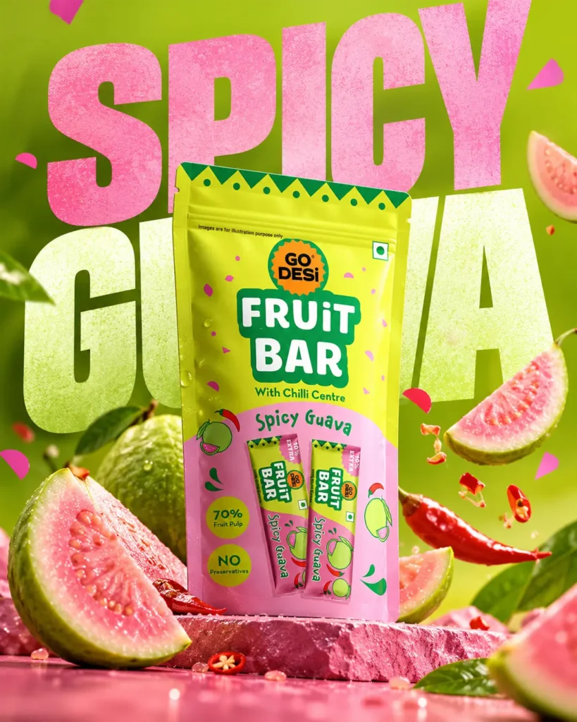
That is clearer than simply saying, “Make it more attractive.”
What Can You Create?
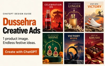
The ChatGPT product ad creatives shown here cover drinks, chocolate, skincare, sneakers and speakers. Each uses different colours and materials while keeping the product as the main focus.

Start with one photo and one direction. Once you like the result, try another layout.
Want to try it? Download the master prompt and use it with your own product photo.

0 Comments